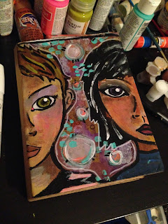
I'm officially back with another face for the 29 Faces challenge! I keep saying this, and I'm sure I will continue to say it - this has been an incredibly fun process for me. I entirely enjoy the feeling of developing ideas in this manner. The more faces I paint, the more ideas I seem to have. Sure, some of the faces are better than others, but that's part of the fun of it all for me.
So, without further ado, onto today's face!
- In this face, the thing that stands out to me the most is the tones in the skin. I went with a lot more orange, yellow and pink than I typically do (mixed in places with browns and whites), and I'm not sure what I think of the result. I think that it's different, and I do like it, but it's an experiment, to be sure.
- I am a big fan of this girl's hair in particular. I'm not sure what it is about it that I like so much, and I do feel as if it could use some touching up (maybe a few more white highlights), but in the long run, it's something I'm definitely happy with.
- In this photo, you can also see the scrap piece of paper I had tucked underneath of my cardboard while I was working. When I went to add color to the page, I would wipe excess paint on this paper - I think it serves as an interesting view of how the face was created!
- In the photo on the left, you cane see this girl's eyeliner, which I also like quite a bit. It was somewhat of an accident - I went to paint the line of the eye and my hand took it a little too far. Essentially it was a happy accident.
- The left photo is probably one of my favorite sections of this little face. If you look closely, you can see some of the graphite shading I did on top of the acrylic paint around the eye area. I also love how the teal markings of the background overlap with her hair. As far as the background is concerned, I'm moving on for now though I may come back to it later.
- The right photo shows a bit of a better view of the textures of the piece - they're rougher, and the cardboard likes to suck up the paint, so you can see a lot of that as well. I love the lips in this piece; the color reminds me a lot of my own lipstick. You can also see where I went to put in an extra line for the area that separates the nose and the mouth and essentially pointed out that the nose was placed wrong. Whoops.
In the long run, I am happy with today's face. I think I'm starting to learn that faces are one of those things that I just need to relax abut. The more I worry about them, the worse I end up doing. Really, I'm better off just letting it flow, and critiquing the work afterwards in order to grow in the future. Here's to even better faces in the future!


Your faces are fabulous. I love the color mix you used. That is truly the lesson I have learned over the last few years with faces. Just let it all flow with ease.
ReplyDeleteI'm glad that you like the colors. With my personality being the way it is, I sometimes have a hard time letting go of control and just letting things flow, especially with something like a face. A big part of me wants to try to control it and tame it, and I'm quickly figuring out that it doesn't quite work that way.
DeleteI'm learning, though! This challenge has been good for that.
You have found the new color blend to use. This is beautiful. I also like the vase shape between the faces (a happy accident?).
ReplyDeleteThank you so much! I really made an effort to try a different skin tone, so I'm glad that other people like the way it turned out as well.
DeleteAs for the vase shape, it was just a fun side effect of drawing the two faces in the manner that I did! It was indeed a happy accident!
your color blend for the faces is beautiful-love the warm tones. Happy PPF!
ReplyDeleteThank you so much, it means a lot that you took the time to visit and I'm glad that you like the colors in the face!
DeleteGorgeous faces! I too love this challenge so much! You may be a bit like me...I love black line in artwork...That's what I love about your style...the nice black lines make me so happy!! I too wear a colour similar to that in lipstick!!Great work! Are you on instagram?
ReplyDeleteHugs Giggles
Black outlines have always been something that appeal to me in all sorts of work (I mean, just look at my blog theme!), I think it adds a great contrast to color. I'm glad that you like the face!
DeleteAnd I am on instagram! My username is worldofimmensum.
Nice paintings and drawings. Nbrs 15 and 6 are my favourites.
ReplyDeleteI'm glad you like my artwork, thank you. This was such a pleasant challenge to be a part of, and I definitely enjoyed every minute of it. I feel as if I've learned a lot, and will continue to develop those skills in the days to come. This was a good jumping off point!
Delete