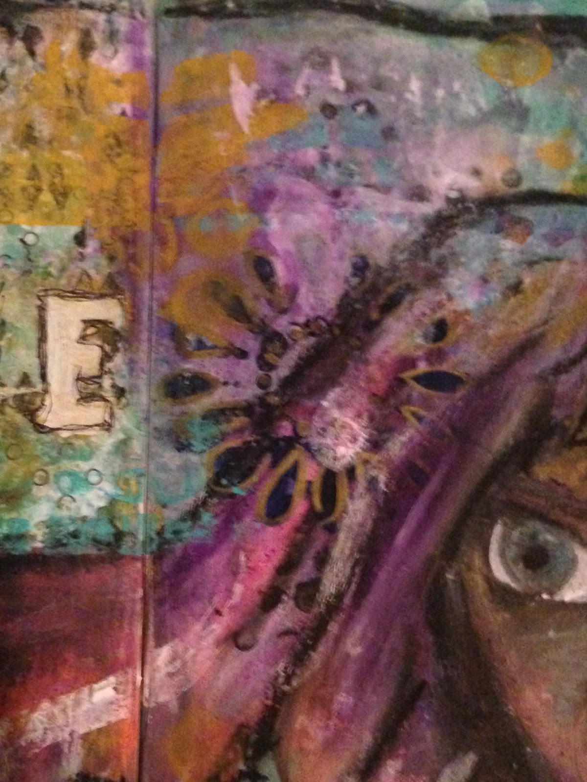
Showing posts with label oil pastels. Show all posts

Friday, September 16, 2016

Oil Pastel Portrait in an Altered Magazine


I'm actually not completely sure how I feel about today's face.

Normally I have pretty strong feelings one way or another, but with this mixed media portrait, I feel a little bit of both. There's a lot that I like and quite a bit that I don't, and it's conflicting. For example, I feel as if there is a lot of potential in this piece when it actually comes to character development - she practically screams fire, both in appearance and in stature.

 I also feel as if the photos here don't exactly do the page justice - however, seeing as I do most of my art journaling at night, I don't see how I can take photographs in sunlight for better results. I'm going to attempt to shift it over at some point, and hopefully that will help.


However, all that being said, onto the actual page!
  • In the first photograph, you can clearly see that I worked this page in the altered magazine I have going. I don't know what makes me decide to work in a particular book or on a particular project, but there was an unfinished portrait on this particular page and it was taunting me.
  • You can also see some of my attempts at a background in this first photograph. I like the portrait itself a lot more than I like the background - likely this page isn't completely finished and I will go back to it later. For me, an art journal page is never truly finished unless I'm happy with it. 
  • Moving on to the second photo, you can see some of the finer details in the skin tone of this girl's face. I worked with it quite a bit, trying to get the blending right without being over the top (I kept accidentally rubbing sections away, I think because the surface was slick), and I'm decently happy with the results. Like many other pages before this one, I used Portfolio oil pastels to do the majority of this face. I also blended the oil pastel with both acrylic paint and graphite pencil.
  • In both of the above photos, you can see the colors of the hair. I used a lot of yellows, oranges and reds, though the intention had originally for her to be blonde. She ended up being more like fire, and I love the result of that.


Now we come to my favorite portion of the page. It's not overly complicated, and there's not a whole lot to say in the long run. However, on the neck portion of this figure, I decided to stamp "fly" with a silver ink pigment ink pad. I adore the result. 

At some angles it's subtle, hardly noticeable at all, and at others it draws from the light source and stands out. Essentially, those are the sorts of details that I love. Also, a shoutout to Paint Party Friday!

I had a lot of fun experimenting with this little piece, and I also think it's cool to point out that a day ago yesterday marked the point of my first oil pastel portrait. In just that short of a time, I've already made immense progress, thanks to all of the practice I've been putting in. It just goes to show, sometimes that's a lot of what it takes!

Thank you all for visiting, and I hope you enjoyed today's page!

Tuesday, September 13, 2016

Art Journal Video + Four Faces


Hello everyone, I'm back and this time I have my third art journal video ever to share with all of you. I know I haven't been incredible consistent with making videos, and I'm not going to promise to do so because I honestly don't have the time to edit them a lot of the time.

However, I am going to be making them whenever I can (most likely on days I don't have to work, like today). I'm also not going to be expanding upon the photographs too much, only because I added captions to my video this time around. However, I will be adding a few comments, so stay tuned!


I broke out the better camera to take these photographs today (honestly, I had just kept forgetting to use it, but I'm glad that I remembered, since these are much clearly and generally better). In the above photograph, you can see a bit of the page opposite the one I was actually working on. You can also see me adding things to it in the video. Essentially this is how I clean my brushes and my stamps, as well as test out ideas. Then I just work over top of the layers later.


In these two photographs, you can see the quote a bit more clearly. I heard this the other day and I just couldn't get it out of my head. I knew that it would become an art journal page eventually, and when I ended up creating a circle with wings that looked good, but didn't really make sense, I knew it was perfect.

I thoroughly enjoy this little section of the page. I grouped the majority of the main elements of the page down in this corner, which gives it a lot of interest (while at the same time using the rest of the page as a way to even out the overall feeling of the piece). 


Finally, I would like to finish the sharing of this page off with what is probably my favorite photograph of it. In the long run, the idea was to work with bright colors. I was starting to miss them after so many warmer tones recently, and I'm glad that I made the decision to do an abstract piece instead of a face (not that I dislike faces, don't get me wrong).

For this page, I'm linking to Creative Artiste Mixed Media for "anything mixed media goes".


Speaking of faces, I did some doodles this morning in an attempt to practice some faces that weren't straight on (not including the girl in the upper left). I think it's fairly obvious that I don't do it very much, but that's exactly why I knew that I needed to practice doing so. I used Prismacolor pencils again today for these sketches - they give a bit of a different look than the Derwent ones that I really like. They both act differently, and because of that, I'm glad that I'm experimenting with both.

Thank you so much for visiting and commenting, it really means a lot to hear from all of you! I hope you enjoyed today's post.

Monday, September 12, 2016

A Fantasy Inspired Art Journal Spread (9.12.2016)


 I had the day off of work today, and because of that, I had the time to complete a couple of faces for 29 Faces! I haven't done more than one face since the second day of the challenge, where I did two sketches in a style similar to the one shown above. I later expanded on one of those sketches later.

However, today only one of my faces is a sketch. This was done while sitting and listening to music - I hadn't been doing much of anything except for browsing the internet. The second I started thinking about it, I got the immediate urge to sketch. I had recently uncovered a set of Prismacolor Premier sketching pencils, so I decided to use them instead of my typical Derwent. I'm pretty happy with the results (I used an HB and a 4B).

This little girl feels pretty determined, which was the intention. I also used the opportunity to experiment with the folds of her clothing a little bit.


My second face was actually created for several challenges. It was done in a composition book, and it's mixed media, as pretty much all of my faces tend to be, unless I force myself to stay in one medium. 

The first challenge that inspired this piece was Mixed Media World's "magical/fantasy" challenge. Likely because I had been creating a lot of faces recently, this was the first thing that came to mind. I combined it with the Mix-It-Monthly challenge "inspired by trees". The third and final challenge this was created for was the More Mixed Media Challenge, "anything goes + optional brown".

The result is something that I'm incredibly proud of.


The majority of the time spent on this piece (I think it took several hours, but I wasn't exactly keeping track) was spent on the face itself. I started out with a background on this particular spread (though with my cardboard series, I haven't been doing anything of the kind), and stayed in colors that sort of screamed fantasy to me (deep browns, reds and greens in particular). I'm glad that I spent so so much time on the face itself, since I'm incredibly happy with the way the page as a whole turned out.

  • On the left, you can see some better details of the face. I especially love the way the antlers/tree branches blend into the hair. I also adore the colors. Dark reds mixed with brown is a color palette I'm going to have to explore more often. 
  • I spent a lot of time on this figure's shirt, trying to get it to feel right. Sometimes I've been known to just put a t-shirt on a character and call it a day, but I really needed to get this one right. Anything too modern would just throw off the entire feel of the spread. Also, I've been trying to get better at clothing, so this was a good chance to do just that.
  • In the right hand photo, you can see the quote that I ended up putting on the page. This was a stamp that I hadn't used at all - that's something else I've been attempting to do, pulling things out of my stash that I've never used and actually doing something with them. Plus, I just love this quote.
  • Also in the second photo, you can see one of my favorite tiny little details, done with another stamp I haven't gotten any use out of. I put little leaf clusters on the tree branches, just for an extra little detail. I adore the result.
I don't know why I've been straying towards warmer colors lately (maybe it's just because autumn is coming and I have it subconsciously on the mind!) but I love the results I've been getting out of it.

Thank you all for taking the time to visit, and I hope you enjoyed seeing my work!

Sunday, September 11, 2016

A Face and Its Remnants (9.11.2016)


After the change with yesterday's face in doing a digital piece, I'm back to mixed media. As you can probably see from the sporadic nature of this blog, I don't like to feel tied down to one medium when it comes to my artwork. I feel like I learn more when I'm constantly learning and practicing new things. 

However, with this piece in particular, I'm working on cardboard again, and for this series in particular I'm sort of attempting to stay with a vaguely similar style for the pieces. This is the first time I've really worked in a series like this (and there's a bit of a secret to it, I'd be curious to see who'll guess first), so I'm really excited about it. 

I'm also particularly happy with today's face (face 12/29 for 29 Faces), so without further ado, let's move on to talking about it.


  • I'm sort of in love with the tones in this face. I used a lot of pinks and yellows and blended with brown and just the tiniest bit of white. After the tones in the face had started to come along, I didn't really feel the need to brighten it up too much. It just felt like if I added anything too crazy, it'd be overwhelming. So, I stuck with muted colors overall, adding a few pops of orange in her lips and the flower. The colors are pretty much my favorite part of this painting.
  • In the photo on the left, you can see the hairstyle a bit better. It didn't turn out quite as I was expecting, but I'm okay with it. However, the hairstyle was the inspiration for the piece - my sister was wearing her hair like this the other day and I couldn't resist.
  • Then we come to the right hand photo. The texture here is crazy. I'm pretty sure that every time I paint on cardboard I comment on the amazing texture, but I just can't help myself. It's incredibly fun to mess around with, and I think everyone should try it at least once. We all have boxes lying around that are waiting to be thrown away - why not cut one down and give it a go?


 I'm not really going to expand on these photographs too much, but they're both from my Instagram story; if you're interested in seeing more progress shots, I've been posting a lot of them there lately.

  • As you can see, the first photograph depicts my rough sketch - and when I say rough, I mean extremely rough. My sketches are purely guidelines, I don't try to overthink it too much. In the long run, they're going to be mostly painted over anyways, so I can make adjustments with paint.
  • The second photo is after some paint had already been applied. Typically I'll go over the skin tones again with a second pencil outline, more defined and to give me a chance to actually outline with the black paint like I've been doing for this series.


The second mixed media piece I have to share with you guys today is probably the first finished art journal page I've actually done since I started the 29 Faces challenge (you can see the traces of my first face on the edge of the page above).

Essentially, it went something like this. 

Lately, once I'm finished painting faces, I have a random assortment of colors on my palette, since it's much easier to apply them there when I'm painting a portrait. A lot of time this leftover paint goes to waste, since I don't always use it and it dries out. I was getting tired of that happening, so I decided to create a journal page to use it all up. 


Since the  colors I used for the face were very autumn-like, I decided that it might be fun to participate in the "colors of autumn" challenge over at Stamps and Stencils. So that's what this page was created for!

  • When I was sorting through some of my art supplied recently, I found some old rubber stamps I had forgotten I owned, the leaves stamped throughout the page. Only one is clearly visible, but there is a second, more narrow leaf stamp you can see if you look closely.
  • In the photo on the left, you can see one of my favorite little portions of the page. Here, the layers haven't been built up as much as in some other areas of the page, and the lines of the composition book and some pencil doodles I did on the very first layer shine through.
  • On the right, you can see a bit of a cluster towards the bottom of the page. I love this little section too - I thought this page was a lot of fun to create. There are book pages torn and glued to the background, splatters, Prismacolor NuPastels (which I recently rediscovered in my stash and am enjoying experimenting with again), and more. 
  • The quote reads "You cannot change the circumstances, the seasons, or the wind, but you can change yourself."


The photos above really just depict closer views of the above photographs, so the descriptions are the same. That doesn't change the fact that I love them!

One last thing before I go. I have a Facebook page where I've been sharing a lot of what I do here, but I feel like a Facebook group has so much more potential than that. So here's my question - do any of you have anything that you love to see? Maybe prompts, discussion questions, or anything along that vein that you'd like to participate in? Because I honestly think it could be a lot of fun.

At any rate, I hope you all enjoyed this post and I'm looking forward to hearing from you!

Friday, September 9, 2016

The Other Half (9.9.2016)


I'm officially back with another face for the 29 Faces challenge!  I keep saying this, and I'm sure I will continue to say it - this has been an incredibly fun process for me. I entirely enjoy the feeling of developing ideas in this manner. The more faces I paint, the more ideas I seem to have. Sure, some of the faces are better than others, but that's part of the fun of it all for me. 

So, without further ado, onto today's face!


 As you can see in the very first photo, this was done on the same piece of cardboard as yesterday's piece. Though I may be playing around with some digital work tomorrow, expect a lot of cardboard experimentation in the near future - I've really been enjoying it!

  • In this face, the thing that stands out to me the most is the tones in the skin. I went with a lot more orange, yellow and pink than I typically do (mixed in places with browns and whites), and I'm not sure what I think of the result. I think that it's different, and I do like it, but it's an experiment, to be sure.
  • I am a big fan of this girl's hair in particular. I'm not sure what it is about it that I like so much, and I do feel as if it could use some touching up (maybe a few more white highlights), but in the long run, it's something I'm definitely happy with.
  • In this photo, you can also see the scrap piece of paper I had tucked underneath of my cardboard while I was working. When I went to add color to the page, I would wipe excess paint on this paper - I think it serves as an interesting view of how the face was created!


  • In the photo on the left, you cane see this girl's eyeliner, which I also like quite a bit. It was somewhat of an accident - I went to paint the line of the eye and my hand took it a little too far. Essentially it was a happy accident. 
  • The left photo is probably one of my favorite sections of this little face. If you look closely, you can see some of the graphite shading I did on top of the acrylic paint around the eye area. I also love how the teal markings of the background overlap with her hair. As far as the background is concerned, I'm moving on for now though I may come back to it later.
  • The right photo shows a bit of a better view of the textures of the piece - they're rougher, and the cardboard likes to suck up the paint, so you can see a lot of that as well. I love the lips in this piece; the color reminds me a lot of my own lipstick. You can also see where I went to put in an extra line for the area that separates the nose and the mouth and essentially pointed out that the nose was placed wrong. Whoops.
In the long run, I am happy with today's face. I think I'm starting to learn that faces are one of those things that I just need to relax abut. The more I worry about them, the worse I end up doing. Really, I'm better off just letting it flow, and critiquing the work afterwards in order to grow in the future. Here's to even better faces in the future!

Tuesday, September 6, 2016

Journal Cover Transformation (9.6.2016)


For today's face for the 29 Faces challenge, I only knew one thing for certain.

I knew that I wanted to transform one of the journals above (they were found in the craft isle of Target and have 60 pages each - they were also dirt cheap and I thought they'd make cute art journals), and I knew that I wanted to do another mixed media piece. I had the idea that I wanted to do a collage/doodle kind of thing, but somewhere along the way, I pulled away. I still might go back to that kind of idea, but for right now, I'm glad that I changed my mind. 


 Here is the completed journal cover. As I said the other day about a mixed media face, I literally could not be happier with this face. There are so many different things that I love about it, and just as I think I've covered them all, I think of more. It is becoming quite obvious to me that the more I do this, the better I get - big surprise there.

This piece is absolutely my aesthetic, everything that I could have hoped it would be. I wasn't exactly going for the punk look when I started her out, but it just happened. In the long run, I'm super excited to start working in this little journal.


In these photos, you can see some close ups of some different parts of the face that I adore.

  • In the left photo, the thing that is front and center is the earring, and it's a little detail that I absolutely adore. I'm not even sure why, especially considering that it's so simple. You can also see some of the detailing of the ultra defined lines - that's one of the things that remained intact from the original idea. The gold around her eyes was gold marker that I added as one of the finishing details.
  • Also on the left, you can see a few black dots peeking out from behind the girl's hair. This is a piece of tissue paper in a pattern I've been hoarding for a good long while, just because I love it so much. I finally decided to break it out for this cover, and I'm glad that I did. 
  • On the right side, you can see a lot more of this girl's clothing details, which I'm also extremely happy with. The cut out panels of her collar seem to fit her style, as does her choker. Both were done simply with acrylic paint. Her shirt was cut out of a piece of paper I had painted on previously and decided would look good for a shirt. I'm also a big fan of the little cluster of stamping and paint above this shoulder. 
  • The face itself is made of a combination of collage, acrylic paint, Portfolio oil pastels, graphite, and markers. Essentially, when it comes to mixed media, I just throw in whatever I think might help the end result.
Overall, I'm extremely happy and excited with the progress I've been making on this challenge. As time goes on, even though it's only the 6th and my 7th face, I feel like I'm making art that I like more. And in the end, that's what it's all about. 

Thank you for visiting, and I look forward to hearing from you!

Thursday, September 1, 2016

Neon Pink + An Oil Pastel Face (9.1.2016)


It's been a little over a week since I last posted, but it's for good reason.

I haven't really been making a whole lot of art (except the past couple of days I broke because I was already starting to miss it) because I've been working on organizing my art space. Ever since we moved into this house, I don't think that it's ever been properly organized. And by that, I mean a place for everything and everything in its place. It's been clean, but never full out organized.

I'm still not quite done with it, but I've made significant progress, and it's incredibly inspiring. Today, I hope I can inspire you.


As you can see both from the photos above and the photo that started the post off, I've really been enjoying working with bright colors recently. I still like my dramatic bits of black, but I've been trying to experiment a bit.

  • Circles have always been aesthetically pleasing to me, and in the photo on the left, you can see four instances of where I used them. I cut some circles out of a piece of phone book paper and glued them down, made some dots with the end of my paintbrush, stamped a dot/circle stamp, and did some paint splatters.
  • As far as the paint splatters are concerned, I made them with watered down white acrylic paint, let them dry partially, then picked up what was left with a paper towel. That's why they come across more like outlines of circles (I didn't outline them painstakingly, I promise). 
  • Recently I acquired a white gel pen, and I had some fun doodling on this page and playing around with it. The white dots within the yellow ochre circle, and the lines in the crosses were all a result of that.  


Recently I've been inspired by Rae Missigman's 15 Minutes of Mixed Media on youtube. She's a big part of the thoughts behind this page, and the whole reason I decided to add neon pink to my paint collection. I would highly recommend that you check her out. 


Something I'm also extremely excited to announce (if I can even call it an announcement) that I'm doing is participating in 29 Faces for the month of September. I was looking around for something I could do this month, due mostly to the fact that it's officially a new month, and stumbled across this amazing challenge.

I can't guarantee that all the faces I do for this challenge will be mixed media (I already have some digital ideas floating around in my head), but the first one absolutely is. There's some collage (her face was a newspaper page cut into the shape of a face and worked on), oil pastels, acrylic paints and graphite. The watercolor look of her hair was thanks to my Portfolio water soluble oil pastels.

I can't even begin to explain how happy I am with the way she turned out. This page is a bit of a work in progress, as I still have a background to go, but as far as the face is concerned, I think I'm going to leave well enough alone. Just creating this face got the ideas flowing for other types of art, and I'll probably be working in my sketchbook based on this before too long.

I'm super excited to see what the rest of this month will hold, and I hope you'll join me in the adventure!

Saturday, August 20, 2016

Happiness + Raindrops (8.20.2016)


I know it's been a few days since I've posted anything on this blog, and that's mostly because I haven't finished a whole lot. 

I've been working on and off on several different projects, but not many of them were titled or officially donned complete. Thus, today I am going to be sharing a finished page and something that's almost finished but not quite there yet. I hope you enjoy looking!


The first page I'm showing here was something I had started a while back - so long ago at this point that I actually don't even remember when I started it. There was just an unfinished page in one of my art journals (the altered magazine I've used in the video here) that I decided to go back to. In the end, I'm incredibly happy with the results.

  • First and foremost, I like the color palette. In the closeups above, you can see that there are many colors that show through in the background, but it is predominantly a soft shade of pink. If I had to guess what I did here, I most likely toned down the layers underneath with a layer of white paint because they were clashing. 
  • The turquoise circles were cut out of a piece of ruled paper I had scraped paint over after completing another page. There were a few more layers on it, and the color and faint lines showing through were far too intriguing to not do something with. As a result, I cut them out and collaged them down, adding layers of paint and oil pastel over the top of them.
  • Here's a sneak peek of what I started to do with the paper left over after cutting the circles.


Finally, we focus in on the quote. Sometimes I read a quote somewhere, whether it be on the motivational app I have or in a book, and I decide that it is something I need to remember. This was one of those times.

Happiness is a direction, not a destination.

Sometimes I need to remind myself of that.


Now we move onto the page that's not quite finished. 

This was simply done on a folded over piece of printer paper, though I decided to switch things up a bit and not fold it perfectly in half. I actually love the way this looks at this point in time, and the drips of paint remind me vaguely of raindrops, which I adore.


Here you can see a little bit of a close up of some of the layers. I especially love the upper cloud, where the paint has been picked up and reveals the background layers. There is some stamping, some stenciling (the clouds are actually stenciled as well), and a lot of paint.

At this point, all I think it truly needs is a title to finish it off. 

 So, as you can see, I've been doing quite a bit in the past few days (there's more where this came from), so you can expect to see from me at some point in the near future, with all of the pages I wrap up. I'll be looking forward to seeing you then!

Monday, August 15, 2016

Take Chances With Your Art (8.15.2016)


If you follow me on instagram, you may have already seen a bit of a sneak peek of this page. However, if you don't, I've been working on this spread over the course of several days and am glad I finally get to share it with you.

There are several things that I like about these pages, and things that I wish were different (it's a bit dark, and the font I used for the title is mediocre). In the long run though, what matters is that I took a risk.


When I chose the title "Be Brave" for this spread, I wasn't sure why it felt so right. It was inspired by the sticker on the chest of the figure, which I just knew was perfect when I saw it.
  • As you can see in the photos above, I tried to incorporate my character's hair into the background a little bit. I used many layers of stamping, collage, stenciling and paint in an attempt to try to get it to feel right. In the end, it's rather blocky in nature, and I'm not sure how I feel about that.
  • The title was created using a stencil, which I have used before when I finished Heart Split in Two. The difference is that in that piece I used the lowercase letters, and in this piece I used the uppercase. I've decided I'm not such a big fan.
  • In the right hand photo, you can see the traces of a flower stencil I used in an attempt to give her a flower in her hair. As subtle as it ended up being, due to the many layers I worked over top of it, I'm a big fan of this portion of the spread.


  • In the first photo, you can see a close up of this girl's face (also a little bit of a better view of the sticker on her chest). This was my first time doing a portrait almost exclusively with oil pastels - typically I'm partial to acrylic paints myself. However, I decided to push outside my comfort zone, and I'm very pleased with the way she turned out. I say almost exclusively because I did use a good bit of graphite pencil, as well as a few traces of acrylic paint (the whites of her eyes and the turquoise in her hair).
  • The right hand photo shows another part of the spread that I love the layering on. You can see some bits of a small dot paper showing through the paint - if you've been paying attention, I've been using scraps of this piece quite a bit lately. It was a 12x12 sheet that I absolutely love, and I'm trying to get the most out of it.
At the end of the day, the title fits.

I took risks with this spread. I created a portrait using oil pastels instead of paints, I used a stencil I had never experimented with before. There was a lot of love that went into this page, and I'm happy with it, even if there are things I would rather change.

At the end of the day, I feel like I was brave.

Thank you all for joining me today, and I look forward to seeing you next time!