Showing posts with label portrait. Show all posts

Sunday, October 2, 2016

A Face in Watercolor and Pen + Inktober Day 2


I am extraordinarily happy with the way today's canvas panel turned out.

When I began the piece, all I had was a doodle of a face I had done on a scratch piece of paper with a Sharpie marker and the desire to work with watercolors. After quite a bit of working with those mediums, this piece came to fruition. It is piece (10/100) for this challenge (I'm at the 1/10 mark!!). 

I love almost everything about it - the coloring in the face itself, the sharp contrast of the doodling and the swirling, almost tattoo-esque designs. In the long run, I'm a big fan. If you're interested in buying this piece, the link is here.

  • In the detail shots I took of this piece, you can see all of the work that I put into the eyes on the face. Though I have a hard time picking my favorite part, if I was required to choose, I might just pick the eyes. I love the way they turned out - solid black outlines in contrast with watercolors is a look I really need to experiment with more in the future.
  • Another thing that you can see in the photos above, specifically the photo on the right, are the swirl stamps that I've been using quite a bit recently. When I was recently sorting through some of my art supplies, this stamp set caught my attention. A lot of the time it's the perfect finishing touch to a project. In this instance, I turned it into a highlight all it's own. 
  • The colors of this piece are another thing that I love - I started out with some faint pinks and oranges, then added the blue and yellow highlights. The brown helps blend everything together into a pleasing color scheme. 


  •  This is the final picture of this particular project I am going to share tonight, and it's one of my favorite photographs that I took. You can see the detail that went into the lips (though it's slightly cut off - there was a lot of cross hatching), as well as the letters stamped in the space between this figures eye and eyebrow. It looked a lot like eyeshadow to me, and I loved that particular aspect of the piece.
  • In the above photo, you can also see a lot of the texture I was able to get into the face. This was partially due to the fact that the doodle I was working on top of was just your everyday printer paper, and partially because some of the Mod Podge I used to glue the piece down was also applied on top. At any rate, I love the way it looks.


In addition to the canvas panel, I also wanted to share this bird I drew using only ink. This was for Day 2 of Inktober (I probably won't be posting everything I do on the blog, but you can find the rest of it on my instagram). and I adore the way it turned out. Even just conceptually, it makes me happy. Overall, today has been a good day for art.

I thank you all for visiting, and I hope you enjoyed your stay! I'll see you next time, when I have more to share!

Wednesday, September 28, 2016

Chalk Pastel Portrait + Developmental Sketches (6/100)


I'm back today with yet another canvas panel for my 100 Day Challenge, but this time with an entirely new direction. Essentially, I had every intention of creating a piece similar in style to the rest of the pieces I have done thus far, but when I went to block out the eye to do in a collage style I used chalk pastels.

Once I had started playing around with a new medium (they were actually Prismacolor NuPastels, which are water-soluble as well), I couldn't stop. Thus, this little partial portrait was born. If you would like to purchase this piece, you can find it here. 

  • I think the tears depicted here were somewhat of a way of working through some issues I've been having recently. I've been reconsidering a lot of things - things that I once believed were set in stone when it comes to my future. I've been extremely emotional lately, and art just seems to be my way of coping with that.
  • As you can see in the above photographs, the texture is a bit different from pure chalk pastel. This is because I actually started blending acrylic paints into the pastels with my fingers at some point, because I wanted to add some depth and variety (as well as texture) that I wasn't quite getting from the pure chalk pastels.

  • The eye itself is another one of my favorite parts about this little piece. I love the coloring and shading that  was able to achieve (plus purple eyes are cool). The chalk pastels mixed with acrylics is definitely something I'm going to need to play with in the near future, no doubt about that.
  • The amount of time I spend working on this piece was well worth the result. I love experimenting and playing with different techniques and things I've never done before (because you can only get better with practice!) so this was a very relaxing, soothing process for me. It helped me come to grips with a few things and I think it was good for me in the long run. 


The last thing I would like to share with you today is this little page of sketches, which I did in preparation for a new digital painting that I actually started working on today. I had the idea for this girl (her appearance and color scheme) in the back of my head for a few days now, and I decided to just take the plunge and do something about it.

I've also started messing around with a new way of organizing my storytelling/art ideas, and if it works out for me, then maybe I'll share it with all of you in the future!

Thank you all for visiting and leaving all of your amazing comments, I don't even know how to explain how good they make me feel, knowing that people actually like what I'm doing. Until next time, I wish you all the best!

Monday, September 26, 2016

The Night Sky + A Watercolor Portrait (4/100)


I am extremely happy with the way today's canvas panel turned out. The colors turned out exactly the way I wanted them to, and circles have always been a bit of a signature motif for me. Because of that, plus the fact that the vision I had in my head actually came to life, I don't know if I could be happier. 

If you would like to purchase this piece, it can be found here.


  • Now we're moving on to a few of the detail shots. In the photo on the left, you can see one of my favorite bits of this little painting - the focal point. I was at the point where the piece was almost completely finished, but it just felt like it was lacking to me. I've really been enjoying playing with this color of paint and I thought I would try it out. I could always paint over it if it didn't work. I like to think that it did.
  • I used several different methods throughout this piece to attempt to tie the circles into the background, in addition to letting them stand out on their own. This included, but wasn't limited to, splattering white paint, stamping, watercolors and NuPastels. 
  • There was a good bit of collage in the background, a lot of which disappears completely, but I know it's there. If you look closely, you can see a few places where words show through and some black dots that were from a piece of patterned tissue paper.


  • I absolutely adore the texture in the first photo. The canvas texture shows through in some places and is completely covered in others. It's one of the things that I've really enjoyed about working on these canvases. 
  • Another part of this piece in particular that I adore are the bits of dots that were stamped over the piece. I feel like it helped to tie the piece together and gave a different size of circle for interest. In the long run, I feel like this piece does exactly what I wanted it to in the first place - shows the concept of a night sky.


I also mentioned the other day that I was still extremely interested in doing faces, and just because I had started a new project, I wasn't going to let creating new characters fall by the wayside. The other night, I was feeling in a watercolor kind of mood, and this girl was born! If you follow me on Instagram (@worldofimmensum), you may have seen progress shots of this portrait in my story.

Honestly, I adore the way she turned out. She feels like she's just screaming for a story, and I think she definitely would have a sword. I've been having a ton of ideas lately based on the art pieces I've created, and that's something that I absolutely adore. It's a big part of my reason for doing art in the first place - this blog is my development place for World of Immensum. I've really been enjoying this whole journey so much, and hope all of you agree with me as well.

Again, thank you all for visiting, and I look forward to hearing from you!

Sunday, September 18, 2016

Mixing Digital and Physical + A Sketchbook Page


Today the art I focused on doing was a lot more oriented towards drawing and not so much painting, but I suppose the first piece could technically be considered mixed media.

This is definitely one of my favorite things I've finished in a good long while, and I'm happy that I even managed to come up with the concept in the first place. It's definitely something I'm going to have to explore in the future. I scanned the page from my art journal I painted yesterday into my computer to start things off.

A big thing I wanted to do was make this painting feel more finished, so I opened the scan in Photoshop and used my drawing tablet to add solid black outlines. I love the way this turned out, and the lines from the composition paper showing through add a sort of subtle touch that I love.


The second thing I have to share with you all today was a age that I finished in my sketchbook (you can see the marker lines peeking through on the opposite page from this sketch) that I absolutely adore.

When I started this page, the only real idea I had in mind was the girl in the lower left hand of the page. I didn't even realize that I was going to give her a body (which is why the one side of her body is sort of falling off of the page), but I'm glad that I did in the long run. She's a character that I'd love to give a final version eventually. 

After I had given her a little bit of work, I started to develop other concepts and felt the need to put them down as well. After it was all said and done, an hour and a half had passed and this was the result. Sometimes a little bit of pointless sketching is great stress relief, and this was one of those instances.

In the long run, today was more of a time to recover from working four days with long hours in a row. I watched a couple of movies and got nice and inspired in that regard, and the ideas are slowly but surely starting to merge and work themselves out. 

Thank you all for joining me, and I hope you're all as excited to see what the next couple of days (that I have off) will hold!

Saturday, September 17, 2016

An Ocean Inspired Watercolor Face


Today's mixed media (but primarily watercolor) face is right up there with some of my favorite pieces I've done for the entire 29 Faces challenge. This is actually my 22nd face that I have completed, despite the fact that it's only the 17th of September (I'm a bit of an overachiever, if you haven't noticed), but I wanted to say that I probably will be continuing to create faces for the rest of the month, even after I hit 29. I've been having an extraordinary amount of fun with it, especially when I manage something that I love as much as this piece.

In the long run, I sort of wish that I had done this piece on a more legitimate surface, rather than a page in a composition notebook, and I don't think I'm going to give this girl any more of a background than she already has. However, I do like the lines peeking through in this piece, so in the end I suppose it all works out.


  • This piece was done in a composition book art journal, as previously stated, but I did decide to prep the surface with a thin later of white acrylic paint that I scraped onto it with a palette knife. The pages were slightly shiny and I wanted /something/ for the watercolor to adhere to, rather than sitting on the surface or sinking into the paper. 
  • As you can probably tell by the photographs, I incorporated a good bit of graphite into this piece. The entire idea for creating this face was to just play with watercolors. I didn't want to be too structured with it, but I didn't want to be too abstract either. I just wanted to have fun and try to curb some of the fear I have of watercolors. For the most part, I feel like I achieved that. 
  • The colors of this piece are honestly one of my favorite parts. The color of her hair originally sprung from trying to incorporate some blue into the actual tones of her skin, but it just sat on top of the face and seemed like it could be shaped into a hairline. I went with it. 


  •  Something you can also see in these photos was something I used on another of my favorite faces I've done, which is a gold marker by Studio G that I got at Michaels for something like $1.50. It writes smoothly on top of paint, and it adds a shine and highlight to the page that I utterly adore. Sometimes it just seems to be the perfect finishing touch.
  • Almost contrasting yesterday's face (though I like today's a lot better), the blue of her hair made me feel as though she could represent water. That was why I decided to go with such a freeflowing neckline for her shirt, almost letting it fade into waves. 
In the long run, it's days like these that make me excited to do challenges like this one - if I paint enough faces, a few are going to stand out as my favorites!

Thank you all for visiting, and I hope you like this girl as much as I do.

Friday, September 16, 2016

Oil Pastel Portrait in an Altered Magazine


I'm actually not completely sure how I feel about today's face.

Normally I have pretty strong feelings one way or another, but with this mixed media portrait, I feel a little bit of both. There's a lot that I like and quite a bit that I don't, and it's conflicting. For example, I feel as if there is a lot of potential in this piece when it actually comes to character development - she practically screams fire, both in appearance and in stature.

 I also feel as if the photos here don't exactly do the page justice - however, seeing as I do most of my art journaling at night, I don't see how I can take photographs in sunlight for better results. I'm going to attempt to shift it over at some point, and hopefully that will help.


However, all that being said, onto the actual page!
  • In the first photograph, you can clearly see that I worked this page in the altered magazine I have going. I don't know what makes me decide to work in a particular book or on a particular project, but there was an unfinished portrait on this particular page and it was taunting me.
  • You can also see some of my attempts at a background in this first photograph. I like the portrait itself a lot more than I like the background - likely this page isn't completely finished and I will go back to it later. For me, an art journal page is never truly finished unless I'm happy with it. 
  • Moving on to the second photo, you can see some of the finer details in the skin tone of this girl's face. I worked with it quite a bit, trying to get the blending right without being over the top (I kept accidentally rubbing sections away, I think because the surface was slick), and I'm decently happy with the results. Like many other pages before this one, I used Portfolio oil pastels to do the majority of this face. I also blended the oil pastel with both acrylic paint and graphite pencil.
  • In both of the above photos, you can see the colors of the hair. I used a lot of yellows, oranges and reds, though the intention had originally for her to be blonde. She ended up being more like fire, and I love the result of that.


Now we come to my favorite portion of the page. It's not overly complicated, and there's not a whole lot to say in the long run. However, on the neck portion of this figure, I decided to stamp "fly" with a silver ink pigment ink pad. I adore the result. 

At some angles it's subtle, hardly noticeable at all, and at others it draws from the light source and stands out. Essentially, those are the sorts of details that I love. Also, a shoutout to Paint Party Friday!

I had a lot of fun experimenting with this little piece, and I also think it's cool to point out that a day ago yesterday marked the point of my first oil pastel portrait. In just that short of a time, I've already made immense progress, thanks to all of the practice I've been putting in. It just goes to show, sometimes that's a lot of what it takes!

Thank you all for visiting, and I hope you enjoyed today's page!

Thursday, September 15, 2016

Mixed Media Canvas Panel + Gelli Printing


 As I look back over the pieces I've done for the 29 Faces challenge, even though we're only halfway through the month, I am continuously impressed and happy with my progress.

Lately I have come to the realization that pushing myself into new directions is a key way of achieving this progress, so I have attempted to make strides in new and interesting directions. Today's face (a painted one for the first time in two days!) serves to do just that.

This piece was done on a 4"x4" canvas panel, so not only is it a size I'm unused to for paintings, I've also never done a face on a canvas panel at all. That wasn't the only way that I challenged myself, with this piece, but it was certainly part of it. A side note, the canvas panels are a bit of a sneak peek at a future project I will be taking on after September is over, so get hyped.


In taking a closer look at the piece, you can hopefully see that though the surface I was working on was small, I attempted to add layers of interest anyways. I couldn't help myself.

  • In the photo on the left, you can the the tiniest hint of a collage piece that I started this square off with. If you watched the video I posted the other day, you may have seen me messing around with a photocopy of a piece of bubble wrap I thought the colors had blended beautifully on. I have several copies of it, actually, but I've been wanting to actually use it. This small surface gave me the change to do just that, and it adds a fun pop of pink.
  • The butterfly is a stamped image on newspaper that has been cut out and collaged on top of the hair - fun fact, I originally attempted to stamp directly onto the canvas, but it didn't work out - so I just used my test stamp, since the light blue paint in the background worked perfectly. 
  • In the right hand photograph, you can see some of the finer details and textures of this girl's face. It was definitely a challenge to work in a small size like this, especially since I was just starting to get used to using certain brushes for painting portraits. However, it worked out in the long run. 


  • This is potentially the most simple part of this mixed media piece, but also potentially my favorite part. Not only did I use yellow ochre, my current favorite color, but I love the way it looks against the gray watercolor.
  • Another favorite part of this little portion is the way the hair seems to blend or merge outside of the lines and into the background, as well as the tiny little bit of text stamp that is visible at the very top of the photograph. 
In the end, I think this face turned out extremely well - the bright blue, yellow and pink stand out against the gray, white and black in a way that I personally like a lot. I'll have to play with the yellow ochre and gray color combination again in the near future!


In addition to finishing the above tiny painting, I also received a Gelli plate in the mail today (I had ordered it a few days back, along with the canvas panels), and I got to play around with it and the paint I had leftover on my palette.

Let me tell you, this was a lot of fun. I think my favorites have to be the pink and brown numbers, and the yellow ochre (surprise) circles in the lower right hand corner. I really love the way those prints in particular turned out, but I'm definitely going to have to put all of these to good use in the near future!

After an extremely stressful past couple of days, it was nice to be able to just sit down with some paint and just play. The more I make art on a regular basis, the more I start to realize just how important it is to me as an individual, both to my mood and the number of creative ideas I have. 

Thank you all for visiting, I appreciate each and every one of you! I hope you all have a nice day, and I'll see you next time.

Monday, September 12, 2016

A Fantasy Inspired Art Journal Spread (9.12.2016)


 I had the day off of work today, and because of that, I had the time to complete a couple of faces for 29 Faces! I haven't done more than one face since the second day of the challenge, where I did two sketches in a style similar to the one shown above. I later expanded on one of those sketches later.

However, today only one of my faces is a sketch. This was done while sitting and listening to music - I hadn't been doing much of anything except for browsing the internet. The second I started thinking about it, I got the immediate urge to sketch. I had recently uncovered a set of Prismacolor Premier sketching pencils, so I decided to use them instead of my typical Derwent. I'm pretty happy with the results (I used an HB and a 4B).

This little girl feels pretty determined, which was the intention. I also used the opportunity to experiment with the folds of her clothing a little bit.


My second face was actually created for several challenges. It was done in a composition book, and it's mixed media, as pretty much all of my faces tend to be, unless I force myself to stay in one medium. 

The first challenge that inspired this piece was Mixed Media World's "magical/fantasy" challenge. Likely because I had been creating a lot of faces recently, this was the first thing that came to mind. I combined it with the Mix-It-Monthly challenge "inspired by trees". The third and final challenge this was created for was the More Mixed Media Challenge, "anything goes + optional brown".

The result is something that I'm incredibly proud of.


The majority of the time spent on this piece (I think it took several hours, but I wasn't exactly keeping track) was spent on the face itself. I started out with a background on this particular spread (though with my cardboard series, I haven't been doing anything of the kind), and stayed in colors that sort of screamed fantasy to me (deep browns, reds and greens in particular). I'm glad that I spent so so much time on the face itself, since I'm incredibly happy with the way the page as a whole turned out.

  • On the left, you can see some better details of the face. I especially love the way the antlers/tree branches blend into the hair. I also adore the colors. Dark reds mixed with brown is a color palette I'm going to have to explore more often. 
  • I spent a lot of time on this figure's shirt, trying to get it to feel right. Sometimes I've been known to just put a t-shirt on a character and call it a day, but I really needed to get this one right. Anything too modern would just throw off the entire feel of the spread. Also, I've been trying to get better at clothing, so this was a good chance to do just that.
  • In the right hand photo, you can see the quote that I ended up putting on the page. This was a stamp that I hadn't used at all - that's something else I've been attempting to do, pulling things out of my stash that I've never used and actually doing something with them. Plus, I just love this quote.
  • Also in the second photo, you can see one of my favorite tiny little details, done with another stamp I haven't gotten any use out of. I put little leaf clusters on the tree branches, just for an extra little detail. I adore the result.
I don't know why I've been straying towards warmer colors lately (maybe it's just because autumn is coming and I have it subconsciously on the mind!) but I love the results I've been getting out of it.

Thank you all for taking the time to visit, and I hope you enjoyed seeing my work!

Sunday, September 11, 2016

A Face and Its Remnants (9.11.2016)


After the change with yesterday's face in doing a digital piece, I'm back to mixed media. As you can probably see from the sporadic nature of this blog, I don't like to feel tied down to one medium when it comes to my artwork. I feel like I learn more when I'm constantly learning and practicing new things. 

However, with this piece in particular, I'm working on cardboard again, and for this series in particular I'm sort of attempting to stay with a vaguely similar style for the pieces. This is the first time I've really worked in a series like this (and there's a bit of a secret to it, I'd be curious to see who'll guess first), so I'm really excited about it. 

I'm also particularly happy with today's face (face 12/29 for 29 Faces), so without further ado, let's move on to talking about it.


  • I'm sort of in love with the tones in this face. I used a lot of pinks and yellows and blended with brown and just the tiniest bit of white. After the tones in the face had started to come along, I didn't really feel the need to brighten it up too much. It just felt like if I added anything too crazy, it'd be overwhelming. So, I stuck with muted colors overall, adding a few pops of orange in her lips and the flower. The colors are pretty much my favorite part of this painting.
  • In the photo on the left, you can see the hairstyle a bit better. It didn't turn out quite as I was expecting, but I'm okay with it. However, the hairstyle was the inspiration for the piece - my sister was wearing her hair like this the other day and I couldn't resist.
  • Then we come to the right hand photo. The texture here is crazy. I'm pretty sure that every time I paint on cardboard I comment on the amazing texture, but I just can't help myself. It's incredibly fun to mess around with, and I think everyone should try it at least once. We all have boxes lying around that are waiting to be thrown away - why not cut one down and give it a go?


 I'm not really going to expand on these photographs too much, but they're both from my Instagram story; if you're interested in seeing more progress shots, I've been posting a lot of them there lately.

  • As you can see, the first photograph depicts my rough sketch - and when I say rough, I mean extremely rough. My sketches are purely guidelines, I don't try to overthink it too much. In the long run, they're going to be mostly painted over anyways, so I can make adjustments with paint.
  • The second photo is after some paint had already been applied. Typically I'll go over the skin tones again with a second pencil outline, more defined and to give me a chance to actually outline with the black paint like I've been doing for this series.


The second mixed media piece I have to share with you guys today is probably the first finished art journal page I've actually done since I started the 29 Faces challenge (you can see the traces of my first face on the edge of the page above).

Essentially, it went something like this. 

Lately, once I'm finished painting faces, I have a random assortment of colors on my palette, since it's much easier to apply them there when I'm painting a portrait. A lot of time this leftover paint goes to waste, since I don't always use it and it dries out. I was getting tired of that happening, so I decided to create a journal page to use it all up. 


Since the  colors I used for the face were very autumn-like, I decided that it might be fun to participate in the "colors of autumn" challenge over at Stamps and Stencils. So that's what this page was created for!

  • When I was sorting through some of my art supplied recently, I found some old rubber stamps I had forgotten I owned, the leaves stamped throughout the page. Only one is clearly visible, but there is a second, more narrow leaf stamp you can see if you look closely.
  • In the photo on the left, you can see one of my favorite little portions of the page. Here, the layers haven't been built up as much as in some other areas of the page, and the lines of the composition book and some pencil doodles I did on the very first layer shine through.
  • On the right, you can see a bit of a cluster towards the bottom of the page. I love this little section too - I thought this page was a lot of fun to create. There are book pages torn and glued to the background, splatters, Prismacolor NuPastels (which I recently rediscovered in my stash and am enjoying experimenting with again), and more. 
  • The quote reads "You cannot change the circumstances, the seasons, or the wind, but you can change yourself."


The photos above really just depict closer views of the above photographs, so the descriptions are the same. That doesn't change the fact that I love them!

One last thing before I go. I have a Facebook page where I've been sharing a lot of what I do here, but I feel like a Facebook group has so much more potential than that. So here's my question - do any of you have anything that you love to see? Maybe prompts, discussion questions, or anything along that vein that you'd like to participate in? Because I honestly think it could be a lot of fun.

At any rate, I hope you all enjoyed this post and I'm looking forward to hearing from you!

Saturday, September 10, 2016

Step-By-Step Digital Face (9.10.2016)

I haven't gotten around to doing any mixed media yet today (not that I won't later tonight), so I decided that I'd take a bit of a different approach to today's face for my 29 Faces. Today I made the decision that I wanted to do a bit of digital work in Photoshop, since I haven't used it in a little over a week, and I felt the urge starting to grow. 

I've also mentioned a couple of times that I was interested in doing some digital art for this challenge, and I finally found the time to do as I've been threatening! This piece in particular was done in Photoshop and took 2 hours and 20 minutes.

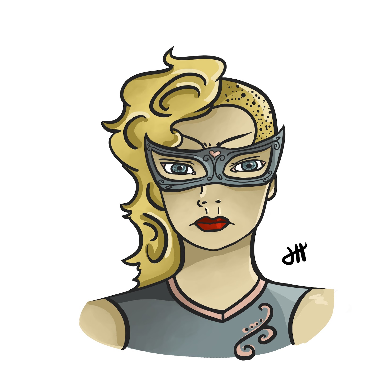
As you can probably guess if you've been following my 29 Faces journey, this face in particular was inspired by one of the first faces I drew for this challenge. I've been wanting to draw her digitally ever since that sketch appeared in my sketchbook, so I'm happy I was finally able to get around to it. She's always felt very superhero-esque to me, so I went for somewhat of a comic book style with this piece.

Now here's the kicker. Ever since I've started this challenge, I've never done a step-by-step or behind the scenes of any kind. However, I figured now was about the time to do so. I love the progression of digital art and the way it looks, so I typically take progress shots anyways. I figured I'd actually share them this time around.
  • As with most pieces of art, my digital art always starts with a rough sketch. This isn't perfect in any sense of the word, and it's solely intended to get ideas down onto the canvas. I typically work my digital sketches in layers, starting with a soft brush to work in large shapes, then I lower the opacity and start a new layer. 
  • On said new layer, I use a smaller soft brush to further define the sketch. This process of lightening the opacity and starting new layers continues until I move to a hard round brush, and the steps continue until I am happy enough with the layout of the sketch to start a serious outline.


  • The "serious outline" is what is depicted in the above screenshot. Essentially, I start a new layer, much as before. However, instead of being so rough and sketchy with the lines, I define them more - they are going to be my final lines, so I want them to look nice. 
  • I used to take a long time on the final outline layer, but I would get so caught up in making sure it was perfect that my pieces could take up to eight hours to complete. Now, I still can take that long to complete a piece, but those are typically full body pieces complete with backgrounds and sometimes several characters.
  • I like Photoshop's "Hard Round" brush for my final sketch because it gives a nice line variation in the thickness, but stays solid in color.


  •  The next step forward is to do a flat color. This is exactly what it sounds like, and it's fairly straightforward. At this stage in the process I don't worry at all about shading or a light source, or anything of the kind. Instead, this step is purely about making sure the color scheme I've chosen works well.
  • It's basically a coloring page at this point - I use a brush to work underneath of the outline layer, filling in color as I see fit. Here I am just making sure that everything works well together, as an overall whole. 
  • In order to avoid becoming repetitive (you can scroll up to the top to see the finished piece again) I've decided to show a photo of the finished piece printed out to show the final steps. I think it looks really nice like this. 
  • The final step is to add shading and highlights. I typically will start with choosing a light source, then adding in darker shadows with a hard round brush. Then a blend it in with a large brush that changes opacity as you press lighter on your tablet. This will add subtle shadows and shading.
  • In the case of this piece, I was going for more of comic book feel, so in addition to that step I also added some harder shadows (most notably underneath of the neck and the mask, as well as in the hair).
  • The final step, and my favorite, is to add highlights. These are reflections from the light source, and it takes a bit of practice to get the placement right (I still have some issues a lot of the time), but they add a ton of dimension that I adore.
Please keep in mind that this is only my process for creating art in Photoshop, and it was due to a lot of continuous practice and evolving of style. However, that being said, if anyone has a drawing tablet laying around that they haven't gotten the nerve to use and you end up being inspired to do so because of this post, I'd love to hear from you!

You can also see this face in my portfolio on my website here.

Thank you all for visiting, and I hope that you enjoyed this post and face as much as I do!