Showing posts with label hearts. Show all posts

Tuesday, September 20, 2016

Inspiring a Character + 29 Faces FINISHED


There are several interesting things to me about art, and this finished page in particular says a few of those things. This page was actually worked on top of something I had already started - every now and again I find it worthwhile to look back through my journals and look for pages I haven't finished yet. I didn't have a whole lot of time tonight, so that was what I decided to do. I love the way that it turned out.

That leads me to my first point about art that I adore. Even when you're happy with the way your art looks on a consistent basis, when you think that you've developed a style, there's still more room to grow. The more you do, the more you work at it, the happier you start to become. At least, that's the way it has ended up working for me.


  • The second thing that I find interesting about art is that, at least for me, the more that I do, the more ideas I seem to have. The words in this particular page illustrate this point. They read as follows. "In all my days, with all the things I've seen - there is nothing much more difficult than fixing a broken heart."
  • As I was working on this page, the drips coming from the heart immediately started screaming to me that it was a broken heart. I didn't have a quote in mind, or any sort of phrase, but what I did know was that I wanted to incorporate a broken heart somehow. As I worked, and continued to build up the page, the words continued to jumble around in my brain, and eventually I managed to spit this out. It didn't come from anywhere except for my own brain, and I can imagine it coming from a wizened old man in a fairy-tale esque story. In fact, a character started to develop out of this page, and that was something I didn't intend to happen when I started it.
  • The sharp contrast of the black with the bright colors is something that I love about this page, and I feel like it plays right in with the feeling of the page. Besides, it's just something that I generally enjoy. 


  •  In both of the above photographs, you can see some black outlines of collage bits I cut out and glued down onto this page. I've been hoarding this scrap for a good long while now, but I've decided that I can't keep things just because I like them - that I need to start using them so that I can buy new things that I like even more. It was just a piece of copy paper that I painted a lot of doodly scribbles on with india ink, and I think it fits this page beautifully.
  • Also in these photos, you can see a lot of the beautiful layering I was able to achieve with this page in particular. The color layered much better than I had even been expecting (I actually never painted the color purple onto the page, which can be seen in the first photo - the colors just mixed that way) and a lot of it I don't even remember doing, since some of it was already down when I got to this page.

  • I want to finish off talking about this page with a close up of the heart itself and the drips that inspired the words. I created the heart with Prismacolor NuPastels, which I've talked about quite a bit recently as something I've been experimenting with and having a whole lot of fun. They're water-soluble, so they spread beautifully, and if you wet them enough when the page is tilted, they create beautiful, inspiring drips like these. 


That brings us to today's face I completed for 29 Faces. It's been a crazy journey, and this actually marks my 29th face. I've finished with a bit of time to spare, but I've definitely learned a lot these past 20 days. I've learned that I love painting faces, and I've awoken a love of watercolor that wasn't there before (as you can see in the sketchbook page shown above). 

After painting my ocean-inspired girl, I felt the need to give my watercolors another go. I also wanted to try out this sketchbook, which I typically use more for pencil sketches, but it has 98 lb paper. It warped a bit, but I think it's manageable, so I'll probably be doing more watercolor in this sketchbook in the future! Ultimately, I like the way this girl turned out. The coloring is perhaps a bit more brown overall than I typically tend to go for, but I'm certainly not opposed. It's definitely better than I could have done at the beginning of this month!

If I've learned anything, it's that painting people is definitely something I'm capable of if I put my mind to it, and that continuous practice is a good way to make significant improvement. Essentially that's what I plan to do this October with Inktober (as well as a top secret upcoming project that I'm super excited to share with all of you).

Thank you all for being with me through this month, I hope you've enjoyed viewing the work I've been sharing as much as I've loved creating it!

Sunday, August 7, 2016

Connections (8.7.2016)


I'm not sure if you can really tell from the photos, but the piece this post is about was done on a canvas. It's the first canvas I've done in a good long while, and I absolutely adore the way it turned out. The layers, the colors, the message - I feel like I've created something I'm proud to call my own and that's a good feeling.

As far as the message is concerned, it's a sort of companion piece to a poem I wrote for my Patreon page. If you look under the "Why Immensum is on Patreon" tab, the bits that are in bold are part of  poem I created to describe my journey. After I had done the mixed media layering of this canvas and was trying to think on what words would fit the feeling of the piece, this phrase is the one that immediately came to mind.


There are far too many layers for me to fully explain all of them, but I'll do my best.

  • The first thing that stands out to me, because it is clearly the focus of the page, is the giant pink heart. That design was actually created via a stencil I made a good while back on a simple piece of printer paper. It was never intended to be used for long term use, but it was made during a period of time when I was experimenting with hearts as a significant theme in my work. I still like the idea of that.
  • The stenciled letters in the upper right hand and lower left hand corners of this canvas are indeed the same stencil as the word 'heart' in the title. For the title word, I applied multiple layers of the while paint in order to make sure it stood out against all the layers of the background and didn't blend into it too much.
  • Speaking of the corners, the lower right hand corner is probably one of my favorite parts of this canvas. You can see that there is a lot of texture, which was created by dabbing on white acrylic paint with a paper towel. There are also a few bits of book paper, layered with some stamping, some watercolors, and a bit of masking tape.


  • In this photo, you can see the details of the title a bit better. I simply used a gel pen to outline the letters of the title, doing it several times for emphasis. The rest of the words were stamped.
  • You can also see in these photos how a bit of the heart has been lifted away. That effect was achieved when the piece got wet, due to an attempt to make some vague drip marks. However, I then proceeded to place a sheet of paper down on the canvas and pull it back up (a technique that you may have seen in the video from my last post. I love the effect that I ultimately got.
As you can probably tell, I sort of love this canvas. It has a bit of personal meaning to me, but I also think that visually it is incredible important. It defines a specific point in my artistic journey, the point where I truly decided that I wanted to try to make art for a living, at least in some capacity.

Also, from the creation of this canvas, I was able to come up with several other ideas of things I would like to try to create in the future - a potential digital drawing inspired by some of my favorite parts of this canvas. But that's the funny thing about art - you always come up with the best ideas when you're creating something else. Thank you all so much for joining me, and I'll see you next time!

Monday, August 1, 2016

Creativity Will Work Itself Out (8.1.2016)


It's been a few days, and I'm back with a couple more pages out of my new art journal!

I've been playing around with a bunch of old techniques I'm just now remembering from all my time away from mixed media, and it's coming back to me, slowly but surely. Although I do like the way this page turned, out, there's still something about it that just feels vaguely unfinished to me. I can't quite figure it out though - I can always come back to it if I figure it out at a later date.


The bit of washi tape you see up close in the right hand photo (with the big arrow pointing to it) actually inspired the color palette of this page. I knew that I wanted to use that piece in particular, and so I took special care to make sure I included it. Eventually, I ended up whiting out all but the word "Relaxation!" and that became the title of my page.

Going back to the left hand photo, you can see the texture I got from the collage base of my page - before doing anything, I created a collage of paper scraps for texture. Maybe I'll go back and outline a few of them.


I absolutely adore this page.

Other than that, I'm not sure just what else to say about it. The colors are perfect for what I was trying to achieve, the title was a style I had never really done before, and hearts have always been a sort of signature of mine. I'm also attracted to the dark ink outlines of the shapes.

Between the restart point of my mixed media and now, this might be my favorite finished page.


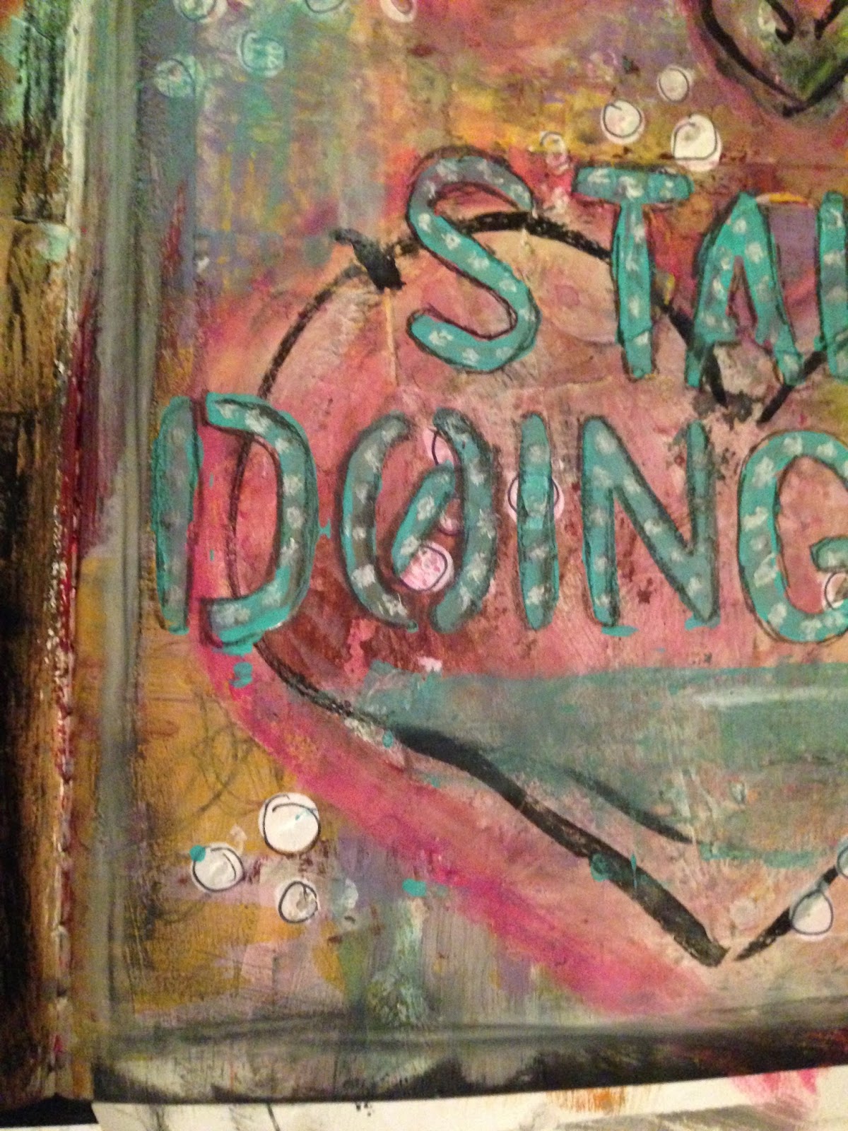
Here you can see some of my favorite little details of the page. As you can see, I did some white dots on the teal colored title, which was a technique I had experimented with here and loved the way it turned out. You can also see the texture created from the piece of punched paper I collaged down, all the layers of paint, the way the ink on the hearts smeared a little (but in an appealing way), and the outlines on all of the little white polka dots (which I did with the eraser of a pencil and some white paint).

Every bit of this page turned out exactly the way I wanted it to, and a lot of it was much better than expected.


These are some other areas of color and texture that I enjoyed.
  • In the left hand photo, I love the colors that were obtained with the blues and pinks and lime greens of the heart. Of the four hearts, the coloring on this one is my favorite. I also love the way the ink smeared, I think it gives it some character.
  • On the right, I think my favorite part is through the yellow, where some of the doodling I did (just with a standard pencil) shows through. The way the dots behind the title compliment it is also a plus.
This page says a lot to me about the way that creativity works. Sometimes you'll go through rough patches and you'll make things that you aren't a big fan of. A couple of things I've been messing with recently have been like that recently. But, if you keep working, it'll all work out in the end.

Thanks for being here, and I'll see you all next time!