Showing posts with label bright. Show all posts

Saturday, September 17, 2016

An Ocean Inspired Watercolor Face


Today's mixed media (but primarily watercolor) face is right up there with some of my favorite pieces I've done for the entire 29 Faces challenge. This is actually my 22nd face that I have completed, despite the fact that it's only the 17th of September (I'm a bit of an overachiever, if you haven't noticed), but I wanted to say that I probably will be continuing to create faces for the rest of the month, even after I hit 29. I've been having an extraordinary amount of fun with it, especially when I manage something that I love as much as this piece.

In the long run, I sort of wish that I had done this piece on a more legitimate surface, rather than a page in a composition notebook, and I don't think I'm going to give this girl any more of a background than she already has. However, I do like the lines peeking through in this piece, so in the end I suppose it all works out.


  • This piece was done in a composition book art journal, as previously stated, but I did decide to prep the surface with a thin later of white acrylic paint that I scraped onto it with a palette knife. The pages were slightly shiny and I wanted /something/ for the watercolor to adhere to, rather than sitting on the surface or sinking into the paper. 
  • As you can probably tell by the photographs, I incorporated a good bit of graphite into this piece. The entire idea for creating this face was to just play with watercolors. I didn't want to be too structured with it, but I didn't want to be too abstract either. I just wanted to have fun and try to curb some of the fear I have of watercolors. For the most part, I feel like I achieved that. 
  • The colors of this piece are honestly one of my favorite parts. The color of her hair originally sprung from trying to incorporate some blue into the actual tones of her skin, but it just sat on top of the face and seemed like it could be shaped into a hairline. I went with it. 


  •  Something you can also see in these photos was something I used on another of my favorite faces I've done, which is a gold marker by Studio G that I got at Michaels for something like $1.50. It writes smoothly on top of paint, and it adds a shine and highlight to the page that I utterly adore. Sometimes it just seems to be the perfect finishing touch.
  • Almost contrasting yesterday's face (though I like today's a lot better), the blue of her hair made me feel as though she could represent water. That was why I decided to go with such a freeflowing neckline for her shirt, almost letting it fade into waves. 
In the long run, it's days like these that make me excited to do challenges like this one - if I paint enough faces, a few are going to stand out as my favorites!

Thank you all for visiting, and I hope you like this girl as much as I do.

Thursday, September 1, 2016

Neon Pink + An Oil Pastel Face (9.1.2016)


It's been a little over a week since I last posted, but it's for good reason.

I haven't really been making a whole lot of art (except the past couple of days I broke because I was already starting to miss it) because I've been working on organizing my art space. Ever since we moved into this house, I don't think that it's ever been properly organized. And by that, I mean a place for everything and everything in its place. It's been clean, but never full out organized.

I'm still not quite done with it, but I've made significant progress, and it's incredibly inspiring. Today, I hope I can inspire you.


As you can see both from the photos above and the photo that started the post off, I've really been enjoying working with bright colors recently. I still like my dramatic bits of black, but I've been trying to experiment a bit.

  • Circles have always been aesthetically pleasing to me, and in the photo on the left, you can see four instances of where I used them. I cut some circles out of a piece of phone book paper and glued them down, made some dots with the end of my paintbrush, stamped a dot/circle stamp, and did some paint splatters.
  • As far as the paint splatters are concerned, I made them with watered down white acrylic paint, let them dry partially, then picked up what was left with a paper towel. That's why they come across more like outlines of circles (I didn't outline them painstakingly, I promise). 
  • Recently I acquired a white gel pen, and I had some fun doodling on this page and playing around with it. The white dots within the yellow ochre circle, and the lines in the crosses were all a result of that.  


Recently I've been inspired by Rae Missigman's 15 Minutes of Mixed Media on youtube. She's a big part of the thoughts behind this page, and the whole reason I decided to add neon pink to my paint collection. I would highly recommend that you check her out. 


Something I'm also extremely excited to announce (if I can even call it an announcement) that I'm doing is participating in 29 Faces for the month of September. I was looking around for something I could do this month, due mostly to the fact that it's officially a new month, and stumbled across this amazing challenge.

I can't guarantee that all the faces I do for this challenge will be mixed media (I already have some digital ideas floating around in my head), but the first one absolutely is. There's some collage (her face was a newspaper page cut into the shape of a face and worked on), oil pastels, acrylic paints and graphite. The watercolor look of her hair was thanks to my Portfolio water soluble oil pastels.

I can't even begin to explain how happy I am with the way she turned out. This page is a bit of a work in progress, as I still have a background to go, but as far as the face is concerned, I think I'm going to leave well enough alone. Just creating this face got the ideas flowing for other types of art, and I'll probably be working in my sketchbook based on this before too long.

I'm super excited to see what the rest of this month will hold, and I hope you'll join me in the adventure!

Tuesday, August 23, 2016

Playing with Colors and Pattern (8.23.2016)


I've been wanting to do another mixed media video since I did one a few weeks back, but my schedule has been fighting me every step of the way. Not only have I been working a decent amount lately, but I've also officially started my freshman year of college.

Needless to say, it's been crazy.

However, I was able to carve out time in that busy schedule to record this video today, and I'm decently happy with the way it turned out.


It's not often that I start an art journal page with an idea in mind. Most of the time, my art journals just aren't that type of art for me. However, in this case, I was willing to make an exception.

On instagram the other day, I posted a picture of a piece of newspaper I had been using as a drop paper for my art. It had collected an assortment of colors that I thought looked good together, even though I had been working on completely different pages when it happened. Those colors were an almost neon pink, a light turquoise, and my current favorite color - yellow ochre.

I knew that I wanted to glue this piece of newspaper down to begin my page, and I had a vague idea of the shapes I wanted to include (the flowers and the scalloped borders). It was more than I normally have.


The textures and colors of this page are what I really love.
  • Here you can see the quote that I chose for this page. I love this quote because it helps me to remember to focus on the present, which is something that I constantly need reminding of.
  • Something I adore about the photo on the left is the greenish color I was able to achieve by mixing a mustard yellow color with the blue I had originally put down. I ultimately loved the effect I was able to achieve. Something I wasn't as big of a fan of can also be seen in this photograph. I don't like the way I put Emily Dickinson on the page, it's too curved and sticks out too much. In the end, this might change.


  •  These are just a couple more detail shots. I wanted to get a bit of a different angle in the photo on the left, and you can see some of the subtle pen doodling near the bottom of the shot that was on the original piece of newspaper. I attempted to recreate that feeling throughout the page with a doodled, playful feeling.
  • And finally, last but not least, on the right you can see my favorite picture I've taken of this page. The colors and textures are nice, and the circles and curved lines represent what I was trying to achieve with this page. If I had to pick my favorite part, this little section would be it.
If you have any questions at all, about how I made this page, what I used to make it, or any ideas of what you would like to see from me in the future, please let me know in the comments, whether it be here or on youtube. I look forward to hearing from you!


Thursday, August 4, 2016

Stencils + A Time Lapse (8.4.2016)


I decided to go with a bit of a different direction for today's post, due to the suggestion of a friend. It's been a good long while since I've done any videos of my art (and even back when I did they were typically livestreams), so I did a time lapse of an art journal spread I put together.

In the long run, I'm really happy with how these pages turned out.


 As you can see from the video, this is a different journal than the one I have been working in, which is just a composition notebook. Instead, this is an altered clothing catalog/magazine, the kind that they send you for free. I'm nothing if not cheap about my bases for mixed media.

Some notes.

  • There are some turquoise dots in the final project that you can see in the photographs that I added after the video was completed. They were simply done with leftover paint from stamping the title and were added with my finger for their random qualities.
  • As is typical of me, I started this page intending to work with bright, almost funky colors. That was where I started, but eventually black came into play. What can I say, it's my weakness.


This is a page that I did on a simple folded over piece of card stock. I'm fairly random when it comes to what I decide to alter, as you can see.

The stencil used on this page is from the same pack that I used on the page above, with the four cutouts of a similar shape on the same piece of cardboard. I bought these stencils from Michael's and have gotten a significant amount of use out of them - I would highly recommend them.


In the long run, I really do like the way this turned out - it's extremely encouraging to me that I'm enjoying the look of most of my recent output. It's like everything I used to know and do is slowly coming back to me, bit by bit, and it's a great form of stress relief.
  • In the left hand photo, you can see some details that I love. After the stenciling and a good bit of coloring had been done, I stamped over the entire page with a small hand carved stamp I did on an eraser. This photo also shows the details of where I stuck down some bits of masking tape underneath a few of the layers.
  • On the right, the thing that stands out the most to me is the outline surrounding the page. I had used bright pink Portfolio pastels to outline the page and smeared it around before using a regular 2B pencil to draw into the pastels. It then proceeded to smudge with my fingers like it had been meant to do just that. I'll have to look into this technique more in the future.
Though the intention of an art journal is to experiment, rather than exclusively create pages that you like, I believe that these two examples say a lot. The more art you create, the more likely you are to come up with something you enjoy.  

So until next time, keep creating, and I'll see you then!

Monday, August 1, 2016

Creativity Will Work Itself Out (8.1.2016)


It's been a few days, and I'm back with a couple more pages out of my new art journal!

I've been playing around with a bunch of old techniques I'm just now remembering from all my time away from mixed media, and it's coming back to me, slowly but surely. Although I do like the way this page turned, out, there's still something about it that just feels vaguely unfinished to me. I can't quite figure it out though - I can always come back to it if I figure it out at a later date.


The bit of washi tape you see up close in the right hand photo (with the big arrow pointing to it) actually inspired the color palette of this page. I knew that I wanted to use that piece in particular, and so I took special care to make sure I included it. Eventually, I ended up whiting out all but the word "Relaxation!" and that became the title of my page.

Going back to the left hand photo, you can see the texture I got from the collage base of my page - before doing anything, I created a collage of paper scraps for texture. Maybe I'll go back and outline a few of them.


I absolutely adore this page.

Other than that, I'm not sure just what else to say about it. The colors are perfect for what I was trying to achieve, the title was a style I had never really done before, and hearts have always been a sort of signature of mine. I'm also attracted to the dark ink outlines of the shapes.

Between the restart point of my mixed media and now, this might be my favorite finished page.


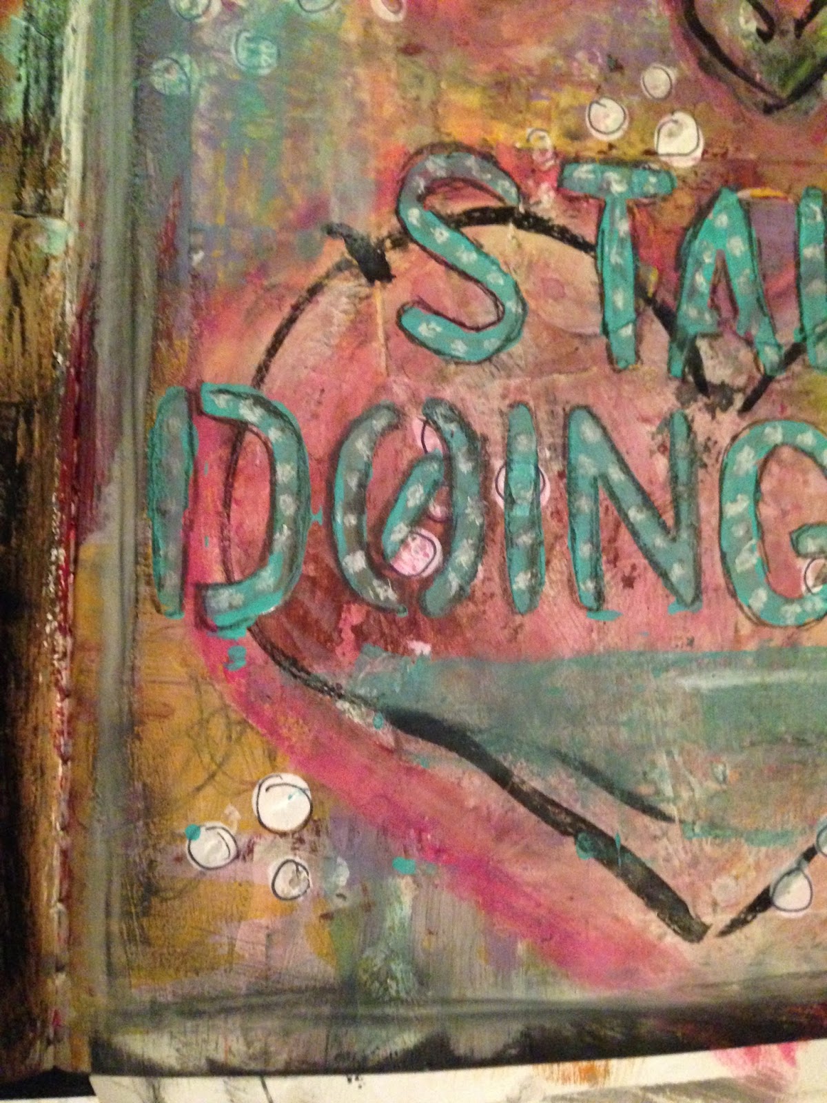
Here you can see some of my favorite little details of the page. As you can see, I did some white dots on the teal colored title, which was a technique I had experimented with here and loved the way it turned out. You can also see the texture created from the piece of punched paper I collaged down, all the layers of paint, the way the ink on the hearts smeared a little (but in an appealing way), and the outlines on all of the little white polka dots (which I did with the eraser of a pencil and some white paint).

Every bit of this page turned out exactly the way I wanted it to, and a lot of it was much better than expected.


These are some other areas of color and texture that I enjoyed.
  • In the left hand photo, I love the colors that were obtained with the blues and pinks and lime greens of the heart. Of the four hearts, the coloring on this one is my favorite. I also love the way the ink smeared, I think it gives it some character.
  • On the right, I think my favorite part is through the yellow, where some of the doodling I did (just with a standard pencil) shows through. The way the dots behind the title compliment it is also a plus.
This page says a lot to me about the way that creativity works. Sometimes you'll go through rough patches and you'll make things that you aren't a big fan of. A couple of things I've been messing with recently have been like that recently. But, if you keep working, it'll all work out in the end.

Thanks for being here, and I'll see you all next time!