Showing posts with label stamps. Show all posts

Sunday, September 11, 2016

A Face and Its Remnants (9.11.2016)


After the change with yesterday's face in doing a digital piece, I'm back to mixed media. As you can probably see from the sporadic nature of this blog, I don't like to feel tied down to one medium when it comes to my artwork. I feel like I learn more when I'm constantly learning and practicing new things. 

However, with this piece in particular, I'm working on cardboard again, and for this series in particular I'm sort of attempting to stay with a vaguely similar style for the pieces. This is the first time I've really worked in a series like this (and there's a bit of a secret to it, I'd be curious to see who'll guess first), so I'm really excited about it. 

I'm also particularly happy with today's face (face 12/29 for 29 Faces), so without further ado, let's move on to talking about it.


  • I'm sort of in love with the tones in this face. I used a lot of pinks and yellows and blended with brown and just the tiniest bit of white. After the tones in the face had started to come along, I didn't really feel the need to brighten it up too much. It just felt like if I added anything too crazy, it'd be overwhelming. So, I stuck with muted colors overall, adding a few pops of orange in her lips and the flower. The colors are pretty much my favorite part of this painting.
  • In the photo on the left, you can see the hairstyle a bit better. It didn't turn out quite as I was expecting, but I'm okay with it. However, the hairstyle was the inspiration for the piece - my sister was wearing her hair like this the other day and I couldn't resist.
  • Then we come to the right hand photo. The texture here is crazy. I'm pretty sure that every time I paint on cardboard I comment on the amazing texture, but I just can't help myself. It's incredibly fun to mess around with, and I think everyone should try it at least once. We all have boxes lying around that are waiting to be thrown away - why not cut one down and give it a go?


 I'm not really going to expand on these photographs too much, but they're both from my Instagram story; if you're interested in seeing more progress shots, I've been posting a lot of them there lately.

  • As you can see, the first photograph depicts my rough sketch - and when I say rough, I mean extremely rough. My sketches are purely guidelines, I don't try to overthink it too much. In the long run, they're going to be mostly painted over anyways, so I can make adjustments with paint.
  • The second photo is after some paint had already been applied. Typically I'll go over the skin tones again with a second pencil outline, more defined and to give me a chance to actually outline with the black paint like I've been doing for this series.


The second mixed media piece I have to share with you guys today is probably the first finished art journal page I've actually done since I started the 29 Faces challenge (you can see the traces of my first face on the edge of the page above).

Essentially, it went something like this. 

Lately, once I'm finished painting faces, I have a random assortment of colors on my palette, since it's much easier to apply them there when I'm painting a portrait. A lot of time this leftover paint goes to waste, since I don't always use it and it dries out. I was getting tired of that happening, so I decided to create a journal page to use it all up. 


Since the  colors I used for the face were very autumn-like, I decided that it might be fun to participate in the "colors of autumn" challenge over at Stamps and Stencils. So that's what this page was created for!

  • When I was sorting through some of my art supplied recently, I found some old rubber stamps I had forgotten I owned, the leaves stamped throughout the page. Only one is clearly visible, but there is a second, more narrow leaf stamp you can see if you look closely.
  • In the photo on the left, you can see one of my favorite little portions of the page. Here, the layers haven't been built up as much as in some other areas of the page, and the lines of the composition book and some pencil doodles I did on the very first layer shine through.
  • On the right, you can see a bit of a cluster towards the bottom of the page. I love this little section too - I thought this page was a lot of fun to create. There are book pages torn and glued to the background, splatters, Prismacolor NuPastels (which I recently rediscovered in my stash and am enjoying experimenting with again), and more. 
  • The quote reads "You cannot change the circumstances, the seasons, or the wind, but you can change yourself."


The photos above really just depict closer views of the above photographs, so the descriptions are the same. That doesn't change the fact that I love them!

One last thing before I go. I have a Facebook page where I've been sharing a lot of what I do here, but I feel like a Facebook group has so much more potential than that. So here's my question - do any of you have anything that you love to see? Maybe prompts, discussion questions, or anything along that vein that you'd like to participate in? Because I honestly think it could be a lot of fun.

At any rate, I hope you all enjoyed this post and I'm looking forward to hearing from you!

Monday, August 1, 2016

Creativity Will Work Itself Out (8.1.2016)


It's been a few days, and I'm back with a couple more pages out of my new art journal!

I've been playing around with a bunch of old techniques I'm just now remembering from all my time away from mixed media, and it's coming back to me, slowly but surely. Although I do like the way this page turned, out, there's still something about it that just feels vaguely unfinished to me. I can't quite figure it out though - I can always come back to it if I figure it out at a later date.


The bit of washi tape you see up close in the right hand photo (with the big arrow pointing to it) actually inspired the color palette of this page. I knew that I wanted to use that piece in particular, and so I took special care to make sure I included it. Eventually, I ended up whiting out all but the word "Relaxation!" and that became the title of my page.

Going back to the left hand photo, you can see the texture I got from the collage base of my page - before doing anything, I created a collage of paper scraps for texture. Maybe I'll go back and outline a few of them.


I absolutely adore this page.

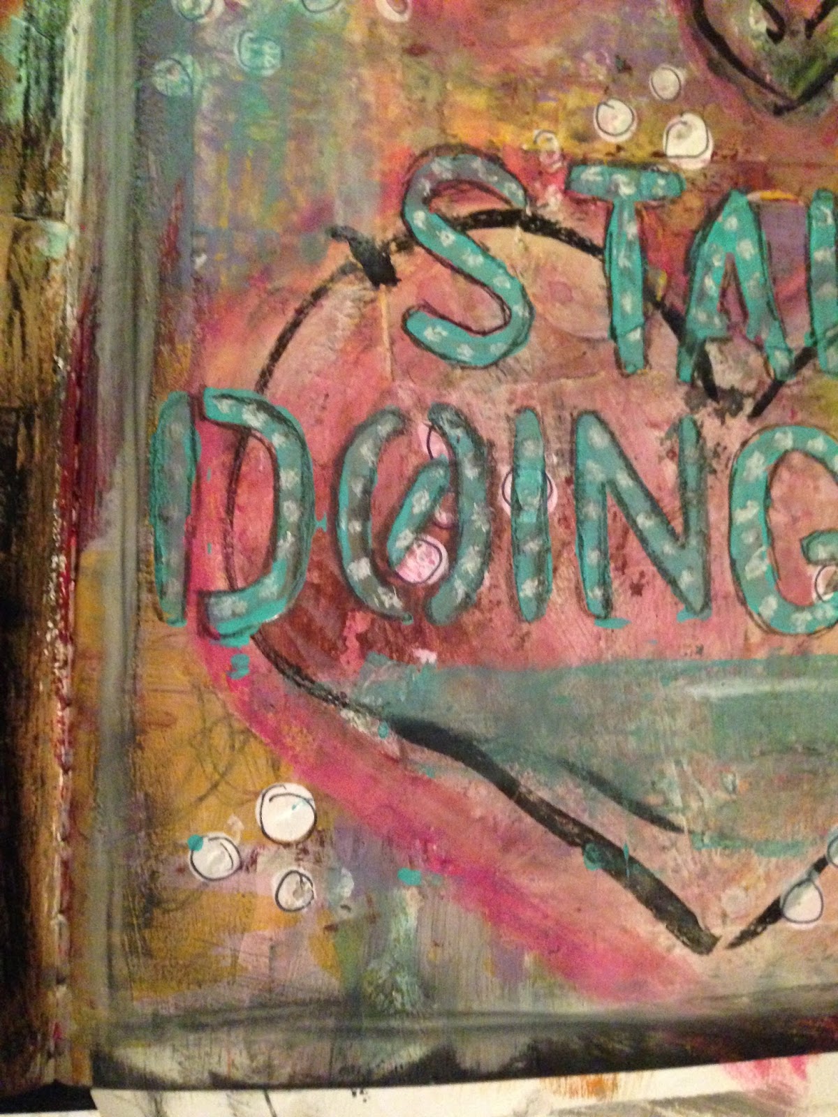
Other than that, I'm not sure just what else to say about it. The colors are perfect for what I was trying to achieve, the title was a style I had never really done before, and hearts have always been a sort of signature of mine. I'm also attracted to the dark ink outlines of the shapes.

Between the restart point of my mixed media and now, this might be my favorite finished page.


Here you can see some of my favorite little details of the page. As you can see, I did some white dots on the teal colored title, which was a technique I had experimented with here and loved the way it turned out. You can also see the texture created from the piece of punched paper I collaged down, all the layers of paint, the way the ink on the hearts smeared a little (but in an appealing way), and the outlines on all of the little white polka dots (which I did with the eraser of a pencil and some white paint).

Every bit of this page turned out exactly the way I wanted it to, and a lot of it was much better than expected.


These are some other areas of color and texture that I enjoyed.
  • In the left hand photo, I love the colors that were obtained with the blues and pinks and lime greens of the heart. Of the four hearts, the coloring on this one is my favorite. I also love the way the ink smeared, I think it gives it some character.
  • On the right, I think my favorite part is through the yellow, where some of the doodling I did (just with a standard pencil) shows through. The way the dots behind the title compliment it is also a plus.
This page says a lot to me about the way that creativity works. Sometimes you'll go through rough patches and you'll make things that you aren't a big fan of. A couple of things I've been messing with recently have been like that recently. But, if you keep working, it'll all work out in the end.

Thanks for being here, and I'll see you all next time!

Thursday, July 28, 2016

The Struggle (7.28.2016)


The title of this page is a direct reference to the making of it.

This was a work and progress over a series of days, and it fought me every step of the way. I'm still not completely happy with the way it turned out, but I decided to call it done. I also heavily considered not sharing it at all, but there are a few small bits that stood out to me as being nice, and I also wanted to show that everyone struggles sometimes.


However, even with the chaos  of the page, there are a few parts that I do like. That's what I keep trying to focus on, and it has helped significantly.
  • First and foremost, on the left, you can see the section on the bottom, where a bit of collage work, green and blue paint, and doodles done in pen show through. As I was proceeding through the layers that followed, I took special care to keep this section intact.
  • On the right, you can see a bit where I did some stitching with thread. Also in this photo you can see multiple layers of paint, stenciling, stamping and collage. As you can see, I was struggling to find something that worked. If this photograph alone was the entire piece, I would be incredibly happy with it.
In the end, we all struggle. Sometimes there's nothing we can do to avoid it, and everything seems to be working against us. The best we can do is push through and focus on the good things. I hope you all got something out of this, and I'll talk to you soon.


Tuesday, July 26, 2016

A Fresh Start (7.26.2016)

Before I get into the actual art, a bit of a note about the World of Immensum. 

Even though all of my more formal artwork all takes place in the same world, my mixed media is more of place for me to play with ideas and techniques - they don't have specific ideas in mind, but they can inspire ideas. With that being said, until I figure out a way to share the stories that come up from this sort of mixed media, I will be focusing on the latter.

Now, without further ado, the art journal awaits!


In order to kick this project off strong, I decided to begin a new journal. 

This is the cover page, which I always love to start with before moving on to the actual pages. For a lot of people, the complete opposite is the case - they like to finish their entire journal before polishing the whole thing off by completing the covers. Either way is fine, this is just the way I like to do it. 


These pictures show a lot of the finer details/my favorite bits of this particular cover.

  • In the left hand photo, you can see a lot of the texture that I got from my stamped title piece. I used foam stamps and a mixture of red and brown acrylic paint. Then I simply loaded it on and allowed it to dry. I also love where the tiny bit of the butterfly wing overlaps with said title piece.
  • On the right, there are a lot of things going on that I love. The thing that sticks out to me the most though is the patterned piece of tissue paper that is pretty much front and center. I've been hoarding it for a long while now, because I found it almost too pretty to use. However, I finally broke, and I'm glad that I did as it fits perfectly. The horizontal brush strokes were done with a metallic paint that I adore.


This is the second piece that I've finished in the past few days, and I'm pretty happy with it. The idea was to work with brighter, more playful colors (thus the title), and was done in a much smaller format, on a 3x5 index card.

A big part of my style is that I don't like to be limited to any one thing, including what types of canvases or background pieces I decide to work on. This is a prime example of just that.


As you can see, the title was cut out of newspaper titles and glued down (I've collected many cut-out letters through the years and have them organized into envelopes for easier access).

With the finer details of this piece, you can see that there are some areas where I put down white paint and then proceeded to scratch it away in a circular pattern, revealing the background behind it. The drawn lines along the yellow paint marks are also incredibly appealing to me.

I tend to use a lot of paint and layers in my mixed media, and these pieces are no exception. I hope you all enjoy looking at these pieces as much as I enjoyed making them, and I look forward to hearing what you think!