Showing posts with label polka dots. Show all posts

Monday, August 15, 2016

Take Chances With Your Art (8.15.2016)


If you follow me on instagram, you may have already seen a bit of a sneak peek of this page. However, if you don't, I've been working on this spread over the course of several days and am glad I finally get to share it with you.

There are several things that I like about these pages, and things that I wish were different (it's a bit dark, and the font I used for the title is mediocre). In the long run though, what matters is that I took a risk.

When I chose the title "Be Brave" for this spread, I wasn't sure why it felt so right. It was inspired by the sticker on the chest of the figure, which I just knew was perfect when I saw it.
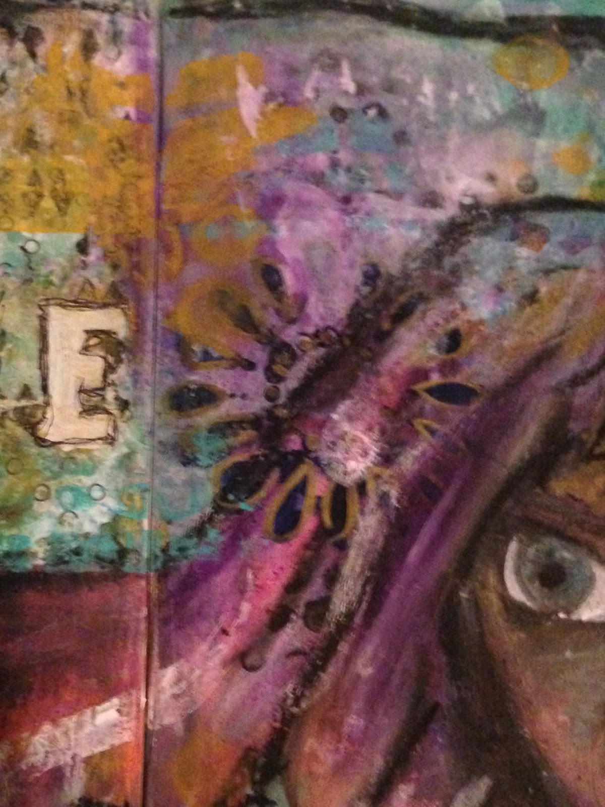
  • As you can see in the photos above, I tried to incorporate my character's hair into the background a little bit. I used many layers of stamping, collage, stenciling and paint in an attempt to try to get it to feel right. In the end, it's rather blocky in nature, and I'm not sure how I feel about that.
  • The title was created using a stencil, which I have used before when I finished Heart Split in Two. The difference is that in that piece I used the lowercase letters, and in this piece I used the uppercase. I've decided I'm not such a big fan.
  • In the right hand photo, you can see the traces of a flower stencil I used in an attempt to give her a flower in her hair. As subtle as it ended up being, due to the many layers I worked over top of it, I'm a big fan of this portion of the spread.


  • In the first photo, you can see a close up of this girl's face (also a little bit of a better view of the sticker on her chest). This was my first time doing a portrait almost exclusively with oil pastels - typically I'm partial to acrylic paints myself. However, I decided to push outside my comfort zone, and I'm very pleased with the way she turned out. I say almost exclusively because I did use a good bit of graphite pencil, as well as a few traces of acrylic paint (the whites of her eyes and the turquoise in her hair).
  • The right hand photo shows another part of the spread that I love the layering on. You can see some bits of a small dot paper showing through the paint - if you've been paying attention, I've been using scraps of this piece quite a bit lately. It was a 12x12 sheet that I absolutely love, and I'm trying to get the most out of it.
At the end of the day, the title fits.

I took risks with this spread. I created a portrait using oil pastels instead of paints, I used a stencil I had never experimented with before. There was a lot of love that went into this page, and I'm happy with it, even if there are things I would rather change.

At the end of the day, I feel like I was brave.

Thank you all for joining me today, and I look forward to seeing you next time!

Monday, August 1, 2016

Creativity Will Work Itself Out (8.1.2016)


It's been a few days, and I'm back with a couple more pages out of my new art journal!

I've been playing around with a bunch of old techniques I'm just now remembering from all my time away from mixed media, and it's coming back to me, slowly but surely. Although I do like the way this page turned, out, there's still something about it that just feels vaguely unfinished to me. I can't quite figure it out though - I can always come back to it if I figure it out at a later date.


The bit of washi tape you see up close in the right hand photo (with the big arrow pointing to it) actually inspired the color palette of this page. I knew that I wanted to use that piece in particular, and so I took special care to make sure I included it. Eventually, I ended up whiting out all but the word "Relaxation!" and that became the title of my page.

Going back to the left hand photo, you can see the texture I got from the collage base of my page - before doing anything, I created a collage of paper scraps for texture. Maybe I'll go back and outline a few of them.


I absolutely adore this page.

Other than that, I'm not sure just what else to say about it. The colors are perfect for what I was trying to achieve, the title was a style I had never really done before, and hearts have always been a sort of signature of mine. I'm also attracted to the dark ink outlines of the shapes.

Between the restart point of my mixed media and now, this might be my favorite finished page.


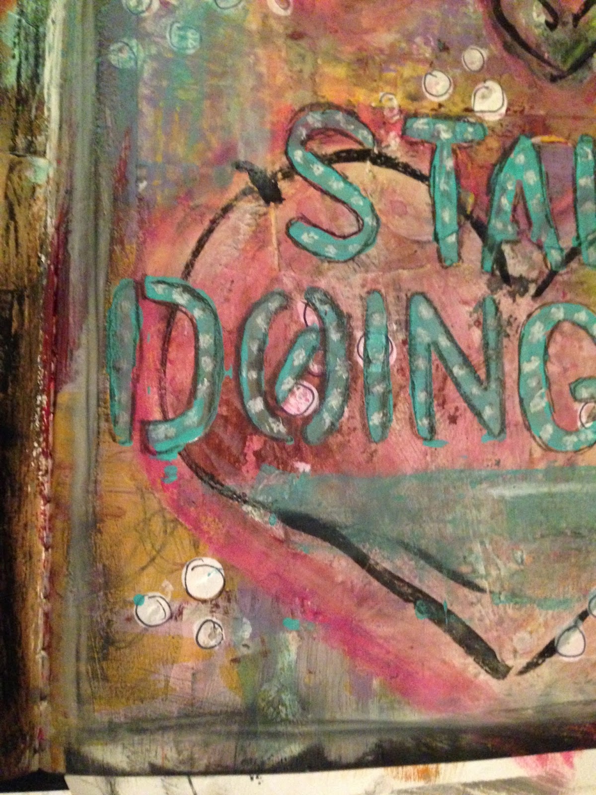
Here you can see some of my favorite little details of the page. As you can see, I did some white dots on the teal colored title, which was a technique I had experimented with here and loved the way it turned out. You can also see the texture created from the piece of punched paper I collaged down, all the layers of paint, the way the ink on the hearts smeared a little (but in an appealing way), and the outlines on all of the little white polka dots (which I did with the eraser of a pencil and some white paint).

Every bit of this page turned out exactly the way I wanted it to, and a lot of it was much better than expected.


These are some other areas of color and texture that I enjoyed.
  • In the left hand photo, I love the colors that were obtained with the blues and pinks and lime greens of the heart. Of the four hearts, the coloring on this one is my favorite. I also love the way the ink smeared, I think it gives it some character.
  • On the right, I think my favorite part is through the yellow, where some of the doodling I did (just with a standard pencil) shows through. The way the dots behind the title compliment it is also a plus.
This page says a lot to me about the way that creativity works. Sometimes you'll go through rough patches and you'll make things that you aren't a big fan of. A couple of things I've been messing with recently have been like that recently. But, if you keep working, it'll all work out in the end.

Thanks for being here, and I'll see you all next time!