Showing posts with label paint. Show all posts

Monday, September 26, 2016

The Night Sky + A Watercolor Portrait (4/100)


I am extremely happy with the way today's canvas panel turned out. The colors turned out exactly the way I wanted them to, and circles have always been a bit of a signature motif for me. Because of that, plus the fact that the vision I had in my head actually came to life, I don't know if I could be happier. 

If you would like to purchase this piece, it can be found here.


  • Now we're moving on to a few of the detail shots. In the photo on the left, you can see one of my favorite bits of this little painting - the focal point. I was at the point where the piece was almost completely finished, but it just felt like it was lacking to me. I've really been enjoying playing with this color of paint and I thought I would try it out. I could always paint over it if it didn't work. I like to think that it did.
  • I used several different methods throughout this piece to attempt to tie the circles into the background, in addition to letting them stand out on their own. This included, but wasn't limited to, splattering white paint, stamping, watercolors and NuPastels. 
  • There was a good bit of collage in the background, a lot of which disappears completely, but I know it's there. If you look closely, you can see a few places where words show through and some black dots that were from a piece of patterned tissue paper.


  • I absolutely adore the texture in the first photo. The canvas texture shows through in some places and is completely covered in others. It's one of the things that I've really enjoyed about working on these canvases. 
  • Another part of this piece in particular that I adore are the bits of dots that were stamped over the piece. I feel like it helped to tie the piece together and gave a different size of circle for interest. In the long run, I feel like this piece does exactly what I wanted it to in the first place - shows the concept of a night sky.


I also mentioned the other day that I was still extremely interested in doing faces, and just because I had started a new project, I wasn't going to let creating new characters fall by the wayside. The other night, I was feeling in a watercolor kind of mood, and this girl was born! If you follow me on Instagram (@worldofimmensum), you may have seen progress shots of this portrait in my story.

Honestly, I adore the way she turned out. She feels like she's just screaming for a story, and I think she definitely would have a sword. I've been having a ton of ideas lately based on the art pieces I've created, and that's something that I absolutely adore. It's a big part of my reason for doing art in the first place - this blog is my development place for World of Immensum. I've really been enjoying this whole journey so much, and hope all of you agree with me as well.

Again, thank you all for visiting, and I look forward to hearing from you!

Sunday, September 25, 2016

A Science Fiction Inspired Canvas Panel (3/100)


I'm extremely happy with the way today's canvas panel for my 100 Day Project turned out. It really defines the style I love to achieve in my art - quirky and almost cartoon-like in style, but with something that is just slightly off (the science fiction twist that I love to throw in). 

In this case, it's that the leaves of these plants are actually eyes. 


The title of this little painting (which is something that I've just recently started doing and am quite fond of) is "The Forest's Eyes". This was yet another one of those projects that I started before heading off to work, then got back with a completely different idea in mind. 
  • Starting off with the photo on the left, one of the subtle elements I added to this canvas were the little circles in both the lower right and upper left of the canvas. I wanted to parody the look of the eyes, as well as add a subtle hint of interest to the equally subtle background. This was how I chose to do that.
  • In both of these photos, you can see the background. It started out with shades of blue, but after having created the plants and adding collage, I decided to add a wash of pink instead. Some of the background layers shone through, but for the most part I covered them up. Then I added the hints of blue and yellow that create the swirled background. I think that further adds to the mystery. 


  •  And finally, for the last image I will share with you all tonight, a close up of the eyes themselves. They were cut from bits and pieces of scrap paper, and if you look closely, the blue leaf in the lower left hand corner may look familiar (it's cut from a scanned copy of this painting). I had a lot of fun with this piece, even if it is fairly straightforward in comparison to my previous two pieces. 
In the long run, though I'm only three days into this self challenge, I've been having a lot of fun with it. The ideas are already starting to churn (I have a title idea that I may work off of tomorrow), and I'm excited to see where this project will lead! If you would like to purchase this piece in particular, you can find the link here. 

Thank you all for joining me, it means a lot, and I look forward to seeing you all next time!

Monday, September 19, 2016

Pen & Ink + Distressed Bright Colors


I would like to start today's post off with today's piece for 29 Faces, which was a whole new kind of experiment for me.

I think I've been gushing about this challenge the entire time I've been doing it - there's really something to working at the same thing consistently, and I've definitely seen significant improvement just in the time I've been working on this challenge. This entire month I've been making an effort to experiment in different mediums, and today's face is the 28th out of 29 faces in the month of September. It was done after being inspired by another challenge that I just recently heard about - Inktober.

Now, I haven't done a whole lot of pen and ink drawings in my day, solely because it's always seemed like an intimidating medium to me. However, seeing as this entire month has been about exploring new things (as I did with watercolor, an equally intimidating medium), I thought it only fitting to do a sample piece for Inktober using a face. This was really about me convincing myself that I could do it if I truly wanted to - I'm so pleased with the result that I probably will be doing Inktober this coming month. So stay tuned!


Now we arrive at the art journal page I finished this afternoon. This was done on the page opposite the one created in this video - in it, you can see me building up a few layers that I built up on top of. That is what makes the color scheme vaguely similar to the previous page - I decided to go with the colors that were already down on the page.

There is something that I really love about this page - I feel like it really describes me in a lot of ways. I love bright colors, but I also love distressing. I love texture and a lot of layers, and this page did all of that for me. 


  • A big part of the purpose of this page was to experiment with the Ranger texture paste I had bought at Michaels the other day. I had bought some texture paste previously, but it wasn't very good and was really more like white paint. I should have known, since it was pretty inexpensive. However, this texture paste was much different - it was thick and I laid it down over top of a stencil to create the pattern of squares you can see throughout the page.4
  • The blue squares scattered throughout the page were punched from the leftover paper I used to draw my face from before - it was a piece of 140 lb paper that I sprayed with Dylusions ink spray and wet with a paintbrush to spread it out over the surface of the paper. The color seemed to work well, so I went with it.
  • You can see just how many layers of paint I put down in the second photograph. It took me quite a while to get this page to a place where I was genuinely happy with it, and these are the little areas that make all of the process worth it for me (besides the fun of playing around with  color).

  • Something I am quickly starting to become a big fan of is doodling in the layers of my pages, specifically underneath a ton of other layers. You can see that in this photograph, with the gold circles I did in sets of three.
  • There are many layers of stamping and paint - you can see the butterflies and dots specifically. Also, if you look closely in the upper left corner, you can see an under-layer of collage I ended up covering almost completely - it was a piece of a gelli print from the other day I was trying to use. I guess I'll have to try again soon.
  • I'm linking this page to Stamplorations Stencil Sunday (mixed media + a stencil), as well as Altered Eclectics (anything mixed media).
In the long run, I'm extremely happy with my creativity results for today - sometimes I feel as if it's too much work to try to juggle it among all the chaos of everything else that is going on in my life, and then I realize just how much better I feel when I do make things and I remember why I do it. 

Thank you all for visiting, I look forward to seeing you around!

Friday, September 9, 2016

The Other Half (9.9.2016)


I'm officially back with another face for the 29 Faces challenge!  I keep saying this, and I'm sure I will continue to say it - this has been an incredibly fun process for me. I entirely enjoy the feeling of developing ideas in this manner. The more faces I paint, the more ideas I seem to have. Sure, some of the faces are better than others, but that's part of the fun of it all for me. 

So, without further ado, onto today's face!


 As you can see in the very first photo, this was done on the same piece of cardboard as yesterday's piece. Though I may be playing around with some digital work tomorrow, expect a lot of cardboard experimentation in the near future - I've really been enjoying it!

  • In this face, the thing that stands out to me the most is the tones in the skin. I went with a lot more orange, yellow and pink than I typically do (mixed in places with browns and whites), and I'm not sure what I think of the result. I think that it's different, and I do like it, but it's an experiment, to be sure.
  • I am a big fan of this girl's hair in particular. I'm not sure what it is about it that I like so much, and I do feel as if it could use some touching up (maybe a few more white highlights), but in the long run, it's something I'm definitely happy with.
  • In this photo, you can also see the scrap piece of paper I had tucked underneath of my cardboard while I was working. When I went to add color to the page, I would wipe excess paint on this paper - I think it serves as an interesting view of how the face was created!


  • In the photo on the left, you cane see this girl's eyeliner, which I also like quite a bit. It was somewhat of an accident - I went to paint the line of the eye and my hand took it a little too far. Essentially it was a happy accident. 
  • The left photo is probably one of my favorite sections of this little face. If you look closely, you can see some of the graphite shading I did on top of the acrylic paint around the eye area. I also love how the teal markings of the background overlap with her hair. As far as the background is concerned, I'm moving on for now though I may come back to it later.
  • The right photo shows a bit of a better view of the textures of the piece - they're rougher, and the cardboard likes to suck up the paint, so you can see a lot of that as well. I love the lips in this piece; the color reminds me a lot of my own lipstick. You can also see where I went to put in an extra line for the area that separates the nose and the mouth and essentially pointed out that the nose was placed wrong. Whoops.
In the long run, I am happy with today's face. I think I'm starting to learn that faces are one of those things that I just need to relax abut. The more I worry about them, the worse I end up doing. Really, I'm better off just letting it flow, and critiquing the work afterwards in order to grow in the future. Here's to even better faces in the future!

Saturday, September 3, 2016

Watercolor Experiments (9.3.2016)


Watercolor is one of those art supplies that I've always had and always wished I was better at using, but I've never actually put the time into learning to use them. They've just always felt intimidating to me, and everyone always seemed so much better at them than me that I hardly ever tried.

But no more!

Recently, I've become intrigued by watercolors as a medium, and I was sick and tired of being intimidated by them. Over the past couple of days, I've been attempting to venture into different ways of using watercolors, and I'll be sharing some of my experiments here.

First and foremost is the photo above. To be completely fair, this piece isn't all watercolor - it's actually Sharpie and gel pens over the top of a watercolor wash. However, this was extremely soothing to experiment with and was a fun way to play around with some ideas that had been floating around in my head.


My next watercolor experiment was much more specific. This is face 4/29 of the 29 Faces challenge, and I'm fairly happy with the way it turned out. The hairstyle was extremely inspired by my new haircut that I got last night, and it's probably my favorite part of this piece. The color scheme is another thing that I'm particularly happy with. 


It's in the close ups that you can see this piece's unique watercolor charm. There are the sorts of things that initially drew me to watercolor in the first place, and I'm happy that I was at least partially able to recreate them.

  • On the left, you can see some of the watercolor stain-like marks, especially in the ear and the corners of the eyes. The shape of shading for the nose is another one of my favorite parts of this piece - it reminds me of a comic book-esque style, of which I am definitely a fan.
  • Here you can also see that I cheated just a bit - I used a Sharpie pen (which I highly recommend, by the way - I love using them for my morning pages and they are extremely pleasant and flow nicely) to add the details of the nose in a dark black. I didn't want them to run, and it seemed to be the perfect tool for the job.
  • On the right, you can see a bit better detail on the lips. I like the expression that this girl in particular has, playful yet somewhat suspicious.

Last, but certainly not least, here you can see some of the finer details of the hair. Playing around with the different shades and layers of brown to create strands was extremely fun to do, and it was much simpler to add texture with watercolors than with a lot of other mediums. 


Now we make our way to the final (work in progress) watercolor experiment that I have to share with you. I saw several people doing this on different social media sites (instagram, pinterest, etc.), and I felt like it would be fun to give it a shot. 

As you can see in these photographs, not all of my blotches of color have doodles in them yet, but this is another thing that I found extremely soothing to do while watching youtube videos or just sitting and listening to music. It was almost meditative. Again, I used a Sharpie pen to make these marks. 

None of these pieces are perfect, but I hope that inspires you to do something with watercolors, especially if they're something that you've been avoiding! What are your opinions on watercolors? I look forward to hearing from you!

Tuesday, August 23, 2016

Playing with Colors and Pattern (8.23.2016)


I've been wanting to do another mixed media video since I did one a few weeks back, but my schedule has been fighting me every step of the way. Not only have I been working a decent amount lately, but I've also officially started my freshman year of college.

Needless to say, it's been crazy.

However, I was able to carve out time in that busy schedule to record this video today, and I'm decently happy with the way it turned out.


It's not often that I start an art journal page with an idea in mind. Most of the time, my art journals just aren't that type of art for me. However, in this case, I was willing to make an exception.

On instagram the other day, I posted a picture of a piece of newspaper I had been using as a drop paper for my art. It had collected an assortment of colors that I thought looked good together, even though I had been working on completely different pages when it happened. Those colors were an almost neon pink, a light turquoise, and my current favorite color - yellow ochre.

I knew that I wanted to glue this piece of newspaper down to begin my page, and I had a vague idea of the shapes I wanted to include (the flowers and the scalloped borders). It was more than I normally have.


The textures and colors of this page are what I really love.
  • Here you can see the quote that I chose for this page. I love this quote because it helps me to remember to focus on the present, which is something that I constantly need reminding of.
  • Something I adore about the photo on the left is the greenish color I was able to achieve by mixing a mustard yellow color with the blue I had originally put down. I ultimately loved the effect I was able to achieve. Something I wasn't as big of a fan of can also be seen in this photograph. I don't like the way I put Emily Dickinson on the page, it's too curved and sticks out too much. In the end, this might change.


  •  These are just a couple more detail shots. I wanted to get a bit of a different angle in the photo on the left, and you can see some of the subtle pen doodling near the bottom of the shot that was on the original piece of newspaper. I attempted to recreate that feeling throughout the page with a doodled, playful feeling.
  • And finally, last but not least, on the right you can see my favorite picture I've taken of this page. The colors and textures are nice, and the circles and curved lines represent what I was trying to achieve with this page. If I had to pick my favorite part, this little section would be it.
If you have any questions at all, about how I made this page, what I used to make it, or any ideas of what you would like to see from me in the future, please let me know in the comments, whether it be here or on youtube. I look forward to hearing from you!


Saturday, August 20, 2016

Happiness + Raindrops (8.20.2016)


I know it's been a few days since I've posted anything on this blog, and that's mostly because I haven't finished a whole lot. 

I've been working on and off on several different projects, but not many of them were titled or officially donned complete. Thus, today I am going to be sharing a finished page and something that's almost finished but not quite there yet. I hope you enjoy looking!


The first page I'm showing here was something I had started a while back - so long ago at this point that I actually don't even remember when I started it. There was just an unfinished page in one of my art journals (the altered magazine I've used in the video here) that I decided to go back to. In the end, I'm incredibly happy with the results.

  • First and foremost, I like the color palette. In the closeups above, you can see that there are many colors that show through in the background, but it is predominantly a soft shade of pink. If I had to guess what I did here, I most likely toned down the layers underneath with a layer of white paint because they were clashing. 
  • The turquoise circles were cut out of a piece of ruled paper I had scraped paint over after completing another page. There were a few more layers on it, and the color and faint lines showing through were far too intriguing to not do something with. As a result, I cut them out and collaged them down, adding layers of paint and oil pastel over the top of them.
  • Here's a sneak peek of what I started to do with the paper left over after cutting the circles.


Finally, we focus in on the quote. Sometimes I read a quote somewhere, whether it be on the motivational app I have or in a book, and I decide that it is something I need to remember. This was one of those times.

Happiness is a direction, not a destination.

Sometimes I need to remind myself of that.


Now we move onto the page that's not quite finished. 

This was simply done on a folded over piece of printer paper, though I decided to switch things up a bit and not fold it perfectly in half. I actually love the way this looks at this point in time, and the drips of paint remind me vaguely of raindrops, which I adore.


Here you can see a little bit of a close up of some of the layers. I especially love the upper cloud, where the paint has been picked up and reveals the background layers. There is some stamping, some stenciling (the clouds are actually stenciled as well), and a lot of paint.

At this point, all I think it truly needs is a title to finish it off. 

 So, as you can see, I've been doing quite a bit in the past few days (there's more where this came from), so you can expect to see from me at some point in the near future, with all of the pages I wrap up. I'll be looking forward to seeing you then!

Monday, August 15, 2016

Take Chances With Your Art (8.15.2016)


If you follow me on instagram, you may have already seen a bit of a sneak peek of this page. However, if you don't, I've been working on this spread over the course of several days and am glad I finally get to share it with you.

There are several things that I like about these pages, and things that I wish were different (it's a bit dark, and the font I used for the title is mediocre). In the long run though, what matters is that I took a risk.


When I chose the title "Be Brave" for this spread, I wasn't sure why it felt so right. It was inspired by the sticker on the chest of the figure, which I just knew was perfect when I saw it.
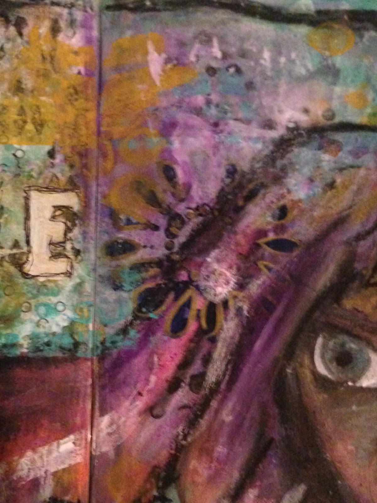
  • As you can see in the photos above, I tried to incorporate my character's hair into the background a little bit. I used many layers of stamping, collage, stenciling and paint in an attempt to try to get it to feel right. In the end, it's rather blocky in nature, and I'm not sure how I feel about that.
  • The title was created using a stencil, which I have used before when I finished Heart Split in Two. The difference is that in that piece I used the lowercase letters, and in this piece I used the uppercase. I've decided I'm not such a big fan.
  • In the right hand photo, you can see the traces of a flower stencil I used in an attempt to give her a flower in her hair. As subtle as it ended up being, due to the many layers I worked over top of it, I'm a big fan of this portion of the spread.


  • In the first photo, you can see a close up of this girl's face (also a little bit of a better view of the sticker on her chest). This was my first time doing a portrait almost exclusively with oil pastels - typically I'm partial to acrylic paints myself. However, I decided to push outside my comfort zone, and I'm very pleased with the way she turned out. I say almost exclusively because I did use a good bit of graphite pencil, as well as a few traces of acrylic paint (the whites of her eyes and the turquoise in her hair).
  • The right hand photo shows another part of the spread that I love the layering on. You can see some bits of a small dot paper showing through the paint - if you've been paying attention, I've been using scraps of this piece quite a bit lately. It was a 12x12 sheet that I absolutely love, and I'm trying to get the most out of it.
At the end of the day, the title fits.

I took risks with this spread. I created a portrait using oil pastels instead of paints, I used a stencil I had never experimented with before. There was a lot of love that went into this page, and I'm happy with it, even if there are things I would rather change.

At the end of the day, I feel like I was brave.

Thank you all for joining me today, and I look forward to seeing you next time!

Thursday, August 11, 2016

Minimal Layers + A Short Story (8.11.2016)


Today's post is going to be a bit of a shorter one, since I've been working quite a bit lately (I just finished seven days straight) and haven't been able to make much time for mixed media. However, among the chaos I was able to make time to put together one page, which is actually pretty minimal in its layers compared to a lot of the other art I've been working on lately.

This page was actually done on the inside of the folded piece of card stock Unseen Beauty was created on, and you can see a little bit of where I began the next page in the edges of these photos. Consider it a sneak peek.


I'm not quite sure why I decided to call this page Awake, considering that I most likely wan't fully awake when I finished it. However, there is a ton that I love about this page and I want to touch on a few points.
  • I started this page off with a page out of the phone book, glued onto the page upside down. The intention was always to keep the layers thin so that the text could show through and I succeeded in doing just that.
  • As you can see in both the left and right hand photos, there are some areas with a scallop pattern. That effect was achieved by putting down a bit of a thicker layer of white acrylic paint and using the end of my paintbrush to carve away the pattern for a bit of texture.
  • The pink circles were collaged down onto the page, and then blended into the background using layers of paint, both acrylic and watercolor, gelatos, oil pastels and a gel pen. I really wanted to focus on these circles in particular on this page - the concept was really what inspired the whole thing.

As much as I love this page, I want to pull away for a minute in order to bring attention to something that one of my art journal pages brought into being. I wrote a short story the other day - I'd say it was in the thriller genre, and it was inspired by a brainstorming session I did while looking at The Evolution of an Idea.

I got there in a pretty roundabout way, and it's not really easy to see any similarities between the two pieces, but there was a connection, just the same. It's called Chosen Fate and can be found here if you want to check it out!

In the end, even though I've been exhausted recently, it makes me happy to share these things with you guys. I hope you enjoy seeing the finished pieces as much as I enjoy making them and I hope to see you all again soon!

Sunday, August 7, 2016

Connections (8.7.2016)


I'm not sure if you can really tell from the photos, but the piece this post is about was done on a canvas. It's the first canvas I've done in a good long while, and I absolutely adore the way it turned out. The layers, the colors, the message - I feel like I've created something I'm proud to call my own and that's a good feeling.

As far as the message is concerned, it's a sort of companion piece to a poem I wrote for my Patreon page. If you look under the "Why Immensum is on Patreon" tab, the bits that are in bold are part of  poem I created to describe my journey. After I had done the mixed media layering of this canvas and was trying to think on what words would fit the feeling of the piece, this phrase is the one that immediately came to mind.


There are far too many layers for me to fully explain all of them, but I'll do my best.

  • The first thing that stands out to me, because it is clearly the focus of the page, is the giant pink heart. That design was actually created via a stencil I made a good while back on a simple piece of printer paper. It was never intended to be used for long term use, but it was made during a period of time when I was experimenting with hearts as a significant theme in my work. I still like the idea of that.
  • The stenciled letters in the upper right hand and lower left hand corners of this canvas are indeed the same stencil as the word 'heart' in the title. For the title word, I applied multiple layers of the while paint in order to make sure it stood out against all the layers of the background and didn't blend into it too much.
  • Speaking of the corners, the lower right hand corner is probably one of my favorite parts of this canvas. You can see that there is a lot of texture, which was created by dabbing on white acrylic paint with a paper towel. There are also a few bits of book paper, layered with some stamping, some watercolors, and a bit of masking tape.


  • In this photo, you can see the details of the title a bit better. I simply used a gel pen to outline the letters of the title, doing it several times for emphasis. The rest of the words were stamped.
  • You can also see in these photos how a bit of the heart has been lifted away. That effect was achieved when the piece got wet, due to an attempt to make some vague drip marks. However, I then proceeded to place a sheet of paper down on the canvas and pull it back up (a technique that you may have seen in the video from my last post. I love the effect that I ultimately got.
As you can probably tell, I sort of love this canvas. It has a bit of personal meaning to me, but I also think that visually it is incredible important. It defines a specific point in my artistic journey, the point where I truly decided that I wanted to try to make art for a living, at least in some capacity.

Also, from the creation of this canvas, I was able to come up with several other ideas of things I would like to try to create in the future - a potential digital drawing inspired by some of my favorite parts of this canvas. But that's the funny thing about art - you always come up with the best ideas when you're creating something else. Thank you all so much for joining me, and I'll see you next time!