Sunday, October 2, 2016

A Face in Watercolor and Pen + Inktober Day 2


I am extraordinarily happy with the way today's canvas panel turned out.

When I began the piece, all I had was a doodle of a face I had done on a scratch piece of paper with a Sharpie marker and the desire to work with watercolors. After quite a bit of working with those mediums, this piece came to fruition. It is piece (10/100) for this challenge (I'm at the 1/10 mark!!). 

I love almost everything about it - the coloring in the face itself, the sharp contrast of the doodling and the swirling, almost tattoo-esque designs. In the long run, I'm a big fan. If you're interested in buying this piece, the link is here.

  • In the detail shots I took of this piece, you can see all of the work that I put into the eyes on the face. Though I have a hard time picking my favorite part, if I was required to choose, I might just pick the eyes. I love the way they turned out - solid black outlines in contrast with watercolors is a look I really need to experiment with more in the future.
  • Another thing that you can see in the photos above, specifically the photo on the right, are the swirl stamps that I've been using quite a bit recently. When I was recently sorting through some of my art supplies, this stamp set caught my attention. A lot of the time it's the perfect finishing touch to a project. In this instance, I turned it into a highlight all it's own. 
  • The colors of this piece are another thing that I love - I started out with some faint pinks and oranges, then added the blue and yellow highlights. The brown helps blend everything together into a pleasing color scheme. 


  •  This is the final picture of this particular project I am going to share tonight, and it's one of my favorite photographs that I took. You can see the detail that went into the lips (though it's slightly cut off - there was a lot of cross hatching), as well as the letters stamped in the space between this figures eye and eyebrow. It looked a lot like eyeshadow to me, and I loved that particular aspect of the piece.
  • In the above photo, you can also see a lot of the texture I was able to get into the face. This was partially due to the fact that the doodle I was working on top of was just your everyday printer paper, and partially because some of the Mod Podge I used to glue the piece down was also applied on top. At any rate, I love the way it looks.


In addition to the canvas panel, I also wanted to share this bird I drew using only ink. This was for Day 2 of Inktober (I probably won't be posting everything I do on the blog, but you can find the rest of it on my instagram). and I adore the way it turned out. Even just conceptually, it makes me happy. Overall, today has been a good day for art.

I thank you all for visiting, and I hope you enjoyed your stay! I'll see you next time, when I have more to share!

Saturday, October 1, 2016

An Art Journal Page of Leftovers (9/100)


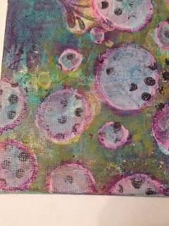
I'm back and joining all of you today with another couple of projects I worked on tonight that I'm really quite proud of. The first is the above canvas panel. I think that I'm slowly but surely starting to get used to this sort of surface, though it's taken a bit of experimentation and adjustment (though not quite as much as a full-out canvas. 

This piece was a bit of a play on my canvas from the other day, though when I started on this canvas it was a fairly unintentional sort of thing. I am happy with the way I was able to differentiate this piece and have it stand well on its own, while still working as a set. If you want to purchase this piece, you can find it here

  • As I mentioned on my instagram this evening, this canvas was really inspired by the colors, specifically the color purple. It's one of those colors that I love, but don't tend to use very often, for reasons unbeknownst to me. I had a lot of fun playing with the blue in combination with the purple (then adding the yellow for good measure and a sense of flow). 
  • I said above that this piece worked well with another piece I had made previously, and in that post I mentioned that the circles were made with a homemade stencil, that I reused here. I can't even tell you all how good it feels to be using my own stencils in my artwork, it just adds another layer of depth to it all, in my opinion.
  • The purple in the circles was done with a Portfolio oil pastel, which I then proceeded to activate by rubbing it with a damp paper towel (you could also use a baby wipe). I love the end result. 


Now I want to share with you something that I have done previously on this blog, and I will continue to do it in the future. When I had completed the above project, I still had quite a bit of paint on my palette that I didn't want to go to waste. I actually have a special journal (not this one) that I use specifically to get rid of my paint leftovers, but there was enough to create a full page and I hadn't worked on an art journal page in a while.

And so, out came the composition notebook!

  • The words placed on this page were very much inspired by how unique I felt this page was to me. Though it is fairly simple (and I'm not completely sure that I'll never add anything to it), I still feel as if it is very uniquely me. 
  • There are several reasons for this, but first and foremost it is because of the doodled pieces that are scattered throughout the page. I had created these as part of a sort of collage sheet fairly near the beginning of last month, and I'm just now getting around to using them. They just seemed to fit. 
  • Another thing that I felt was very much particular to my style in particular is that I used yet another one of my stencils I created in this piece. The oval shapes were this very stencil, and it's quickly becoming one of my favorites. 
In the long run, I'm very happy with the way these mixed media pieces turned out, though I think I prefer the canvas panel. That's only if I had to pick a favorite. I've actually been spending a lot of time with my art today, and I ended up finishing a digital piece and my first drawing for Inktober if you want to check my instagram (@worldofimmensum). 

Thank you all again for visiting me, it's greatly appreciated, and I'll see you all next time!

Friday, September 30, 2016

2 Panel Update (7+8/100)


Hey everyone, I'm back with another one of my 100 Day Challenge updates! If you're following me on Instagram, you'll have already seen that I did in fact still do a mini canvas yesterday, despite the fact that I didn't update the blog. If I'm not around on here, you can find me over there at worldofimmensum.

However, back to the art itself! Yesterday's piece was definitely a way for me to try to work through some rough emotions I was experiencing. I got through that by scribbling with pencil chaotically on the very first layer. I further emphasized it through the thick black outlines and gestural shapes. I definitely did feel better by the time I was finished. At first, I wasn't sure how I felt about it, but it's definitely starting to grow on. 


  • By this point, you guys are probably starting to spot some reoccurring shapes/materials in my artwork. In this piece in particular, you may recognize the diamond stamp. You can see this in both of the above photographs. There's just something intriguing to me about the texture it gives. It's similar to dots (another weakness of mine) but varied just a bit. 
  • Another thing you may recognize is the polka dot tissue paper that is collaged inside of the oval shapes. This is one of my very favorite things to add to pieces, just because of the way it almost appears as a stamp, since the background shows through whatever parts aren't black. 


 Next up is today's piece! I do like the way this little canvas turned out, since in my opinion it is pretty personal. In my eyes, this canvas is a representation of my artistic journey, which is why it looks vaguely chaotic. All of these different styles are originating from the same point, and I love that. The colors were also fun to play with.

  • Looking at some of the finer details of the piece (the photo on the left stands out to me in particular), you can see that a lot of work went into getting this piece to look the way it does. There was stamping, stenciling, finger painting, collage, and basically whatever else I could think of. 
  • The fine details of this organized chaos are really what I love the most, and you can see a lot of that in the photo on the left. The blue plant is the final of three stencils I made about a week back, and I've loved working with them. The dots were done with the tips of my fingers and acrylic paint. 


In the photo on the left (another one of my favorite photos I've taken of this piece), you may recognize the mushroom from a while back. I had drawn them, then photocopied the drawing I did, to use the copies in my art. That was exactly what I did here. 

In the long run, this is the way my mind works. It's crazy, it's a little bit structured and a little bit not, but in the end it all comes together. I'm glad it worked out the way it did, even if it does make me feel kind of vulnerable putting it out there. 

If you would like to buy either of the canvas panels in this post, they can be found here and here.

Until next time, I hope you all do well!

Wednesday, September 28, 2016

Chalk Pastel Portrait + Developmental Sketches (6/100)


I'm back today with yet another canvas panel for my 100 Day Challenge, but this time with an entirely new direction. Essentially, I had every intention of creating a piece similar in style to the rest of the pieces I have done thus far, but when I went to block out the eye to do in a collage style I used chalk pastels.

Once I had started playing around with a new medium (they were actually Prismacolor NuPastels, which are water-soluble as well), I couldn't stop. Thus, this little partial portrait was born. If you would like to purchase this piece, you can find it here

  • I think the tears depicted here were somewhat of a way of working through some issues I've been having recently. I've been reconsidering a lot of things - things that I once believed were set in stone when it comes to my future. I've been extremely emotional lately, and art just seems to be my way of coping with that.
  • As you can see in the above photographs, the texture is a bit different from pure chalk pastel. This is because I actually started blending acrylic paints into the pastels with my fingers at some point, because I wanted to add some depth and variety (as well as texture) that I wasn't quite getting from the pure chalk pastels.

  • The eye itself is another one of my favorite parts about this little piece. I love the coloring and shading that  was able to achieve (plus purple eyes are cool). The chalk pastels mixed with acrylics is definitely something I'm going to need to play with in the near future, no doubt about that.
  • The amount of time I spend working on this piece was well worth the result. I love experimenting and playing with different techniques and things I've never done before (because you can only get better with practice!) so this was a very relaxing, soothing process for me. It helped me come to grips with a few things and I think it was good for me in the long run. 


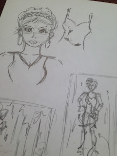
The last thing I would like to share with you today is this little page of sketches, which I did in preparation for a new digital painting that I actually started working on today. I had the idea for this girl (her appearance and color scheme) in the back of my head for a few days now, and I decided to just take the plunge and do something about it.

I've also started messing around with a new way of organizing my storytelling/art ideas, and if it works out for me, then maybe I'll share it with all of you in the future!

Thank you all for visiting and leaving all of your amazing comments, I don't even know how to explain how good they make me feel, knowing that people actually like what I'm doing. Until next time, I wish you all the best!

Tuesday, September 27, 2016

Pinks and Grays in Canvas Form (5/100)


The more I create mixed media art with the intention to portray a specific message, the more I tend to enjoy the work that I produce. This piece is no exception. 

When I started today's 4x4 canvas for my 100 Day Project, I only had one idea in mind. I knew that I wanted to completely cover the base in newspaper (though the majority of it ended up being covered completely in the final project). However, after that point, I didn't have the slightest clue as to where I was headed. However, as soon as I stamped the butterflies (one actually was covered up), I knew that I wanted to tell something about flying, or moving forward. The catch? I've recently been trying to avoid words. I think it worked out in the long run. 

The link to purchase this piece is here.


  • In looking at the finer details of this piece, the thing that stands out to me as something I want to explore in the future is the graphite I used on this particular painting. With some experimentation, I discovered that graphite actually blends incredibly well on top of acrylic paint. I have ideas in mind for how I will play with that in the future.
  • I used my gold marker for the arrows in this particular piece - that is certainly an investment that has been well worth the $1.50 I think I paid for it. Gold details are quickly becoming one of my favorite things to add to a piece of art as the final finishing touch. On top of that gold marker (which I layered on top of white acrylic paint), I doodled some lines with a white gel pen.


  • The photo on the left is probably my favorite photo I've taken of this piece. You can see the texture incredibly well, that was created from smudging graphite over top of the acrylic paint, as well as some tissue paper that I layered into the background. 
  • The stencil that I used to create the horizontal ovals was actually one of the hand cut stencils I mentioned yesterday. I have been enjoying playing with those pieces (I still have one more to play with before I start repeating myself), and I'm sure they will soon become essentials in my mixed media stash. 
  • Finally, the little pink dots scattered throughout this piece I actually just made with my fingers. My paint had been sitting out for a little while, seeing as I had taken a break to eat, so it was too tacky to use a paintbrush with. I love the result of these little dots.
Ultimately, I love the way this canvas turned out, and I hope you all love it as much as I do! Thank you all for visiting, I've been having so much fun sharing my art with all of you!


Monday, September 26, 2016

The Night Sky + A Watercolor Portrait (4/100)


I am extremely happy with the way today's canvas panel turned out. The colors turned out exactly the way I wanted them to, and circles have always been a bit of a signature motif for me. Because of that, plus the fact that the vision I had in my head actually came to life, I don't know if I could be happier. 

If you would like to purchase this piece, it can be found here.


  • Now we're moving on to a few of the detail shots. In the photo on the left, you can see one of my favorite bits of this little painting - the focal point. I was at the point where the piece was almost completely finished, but it just felt like it was lacking to me. I've really been enjoying playing with this color of paint and I thought I would try it out. I could always paint over it if it didn't work. I like to think that it did.
  • I used several different methods throughout this piece to attempt to tie the circles into the background, in addition to letting them stand out on their own. This included, but wasn't limited to, splattering white paint, stamping, watercolors and NuPastels. 
  • There was a good bit of collage in the background, a lot of which disappears completely, but I know it's there. If you look closely, you can see a few places where words show through and some black dots that were from a piece of patterned tissue paper.


  • I absolutely adore the texture in the first photo. The canvas texture shows through in some places and is completely covered in others. It's one of the things that I've really enjoyed about working on these canvases. 
  • Another part of this piece in particular that I adore are the bits of dots that were stamped over the piece. I feel like it helped to tie the piece together and gave a different size of circle for interest. In the long run, I feel like this piece does exactly what I wanted it to in the first place - shows the concept of a night sky.


I also mentioned the other day that I was still extremely interested in doing faces, and just because I had started a new project, I wasn't going to let creating new characters fall by the wayside. The other night, I was feeling in a watercolor kind of mood, and this girl was born! If you follow me on Instagram (@worldofimmensum), you may have seen progress shots of this portrait in my story.

Honestly, I adore the way she turned out. She feels like she's just screaming for a story, and I think she definitely would have a sword. I've been having a ton of ideas lately based on the art pieces I've created, and that's something that I absolutely adore. It's a big part of my reason for doing art in the first place - this blog is my development place for World of Immensum. I've really been enjoying this whole journey so much, and hope all of you agree with me as well.

Again, thank you all for visiting, and I look forward to hearing from you!

Sunday, September 25, 2016

A Science Fiction Inspired Canvas Panel (3/100)


I'm extremely happy with the way today's canvas panel for my 100 Day Project turned out. It really defines the style I love to achieve in my art - quirky and almost cartoon-like in style, but with something that is just slightly off (the science fiction twist that I love to throw in). 

In this case, it's that the leaves of these plants are actually eyes. 


The title of this little painting (which is something that I've just recently started doing and am quite fond of) is "The Forest's Eyes". This was yet another one of those projects that I started before heading off to work, then got back with a completely different idea in mind. 
  • Starting off with the photo on the left, one of the subtle elements I added to this canvas were the little circles in both the lower right and upper left of the canvas. I wanted to parody the look of the eyes, as well as add a subtle hint of interest to the equally subtle background. This was how I chose to do that.
  • In both of these photos, you can see the background. It started out with shades of blue, but after having created the plants and adding collage, I decided to add a wash of pink instead. Some of the background layers shone through, but for the most part I covered them up. Then I added the hints of blue and yellow that create the swirled background. I think that further adds to the mystery. 


  •  And finally, for the last image I will share with you all tonight, a close up of the eyes themselves. They were cut from bits and pieces of scrap paper, and if you look closely, the blue leaf in the lower left hand corner may look familiar (it's cut from a scanned copy of this painting). I had a lot of fun with this piece, even if it is fairly straightforward in comparison to my previous two pieces. 
In the long run, though I'm only three days into this self challenge, I've been having a lot of fun with it. The ideas are already starting to churn (I have a title idea that I may work off of tomorrow), and I'm excited to see where this project will lead! If you would like to purchase this piece in particular, you can find the link here

Thank you all for joining me, it means a lot, and I look forward to seeing you all next time!